Tracy Holdeman
Wichita Ballet Logo Design, Wichita Kansas

A Logo Design from a Different Perspective.
The Wichita Ballet logo design isn't about the dancers, it's about the audience. It's about how a live performance can change a persons outlook on life. It's about the audience: buying a ticket sometimes weeks or months in advance, waiting for the day of the performance, getting through the hustle and traffic and finally arriving at the theater, finding the correct seat, reading the program, waiting, anticipating. The lights dim. The excitement is palpable. Then, the first dancer bursts onto the stage. The crowd cheers. The Wichita Ballet logo design is about that moment. That moment from the fan's eyes and emotions. The entrance. The applause. The wow.
The Wichita Ballet logo design is used on letterhead, business cards, website designs, advertising and promotional material.
Exploration Place logo critique
Critique of Exploration Place Logo.
Exploration Place needs a better logo design.
The concept of Exploration Place is a place for families and especially children to play and learn – explore the wonders of science. So the name is wonderful but the graphic design is devoid of imagination, thought and relevance to the concept of kids exploring and learning while having fun.
The Exploration Place logo design is a poor excuse for logo design or graphic design and adds to the perception that graphic design in Kansas and the City of Wichita is sub-par compared to larger urban areas. The logo design is your basic run-of-the-mill font altered with incongruent graphic shapes that don't relate to the font, each other or the idea of exploring and fun. Some of the partial ellipses and circles in bright colors make a complete oval or circle like the "p", "A" and the "i". Others like the "E", "t" and the "n' have severed the circular shape. The "r" isn't even a curve. Not to mention that none of the bright colored circular shapes even have the same curve. Plus, why is the "A" capitalized?
Logo Design Wichita, KS – Tanya's Soup Kitchen
http://www.youtube.com/watch?v=73wiBugaNX0
The Tanya's Soup Kitchen logo design is the image of Tanya Tandoc and a bowl of soup in the same image. The Tanya's Soup Kitchen logo design is a visual metaphor to show Tanya is the equal of a true artist. Tanya puts herself into her creations, her art, her soup.
In the logo design Tanya's face is the bowl, her mouth is the spoon, her eyes are splashes/droplets and her hair is the steam. All the graphic design shapes and lines of this logo where drawn and redrawn, then scanned into digital form and re-drawn digitally. All the graphic design edges and curves were smoothed and softened to invite the viewer and remind the consumer of how beautifully delicious Tanya's soups really are.
Tanya and the Tanya's Soup Kitchen logo design and graphic design brand identity have become interchangeable, recognized as one-in-the-same. Her website design and Facebook persona allows Tanya to share her unique attitudes with her many fans and friends. All the graphic design in Tanya's brand identity reflects and has become the symbol for Tanya's amazing personality. Tanya has become more than a proprietor of a sheik restaurant, she has become a food goddess and a beacon for sub-culture lifestyles and attitudes. The early lines anticipating a bowl of Tanya's amazing soup often extend from one side of the restaurant to the other and even out of the door. Tanya has become famous in the Wichita area and well know in the highest perches of the food industry.
This brand identity video includes; logo design, website design, environmental and print.
oin the attitude at
http://www.facebook.com/tanyassoupkitchen
http://www.facebook.com/tanya.tandoc
http://tanyassoupkitchen.com/
Tanya's Soup Kitchen is located at: 1725 East Douglas Avenue Wichita, KS 67211
Tracy Holdeman is founder and creative director of Insight Design Communications, executive creative director of WhisperNewYork. His logo design, brand identity, website design and graphic design work has been recognized with over 100 national and international awards.
Insight Design Communications has been honneres with over 100 international awards for logo design, graphic design and brand identity design.
You can see more of Tracy Holdeman's graphic design work at Logo Design Wichita
Logo design, website design and brand development at Parsons School of Art and Design in NYC
Visiting professor at Parsons School of Design in NYC.
I was asked by to be a guest professor at Parsons School of Art and Design in NYC to discuss logo design, website design and brand development.
The class discussions centered around difference, making a difference, finding the difference in a clients company. A great deal of questions and back and forth with a class full of students, about how to find what is different and bringing forth the difference in relevant ways to consumers and general public.
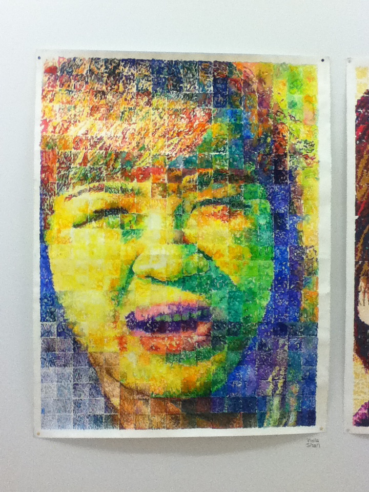
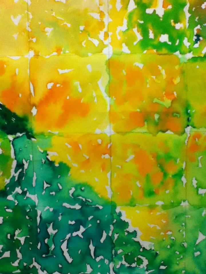
Being at the school and the young minds full of innocence and excitement was invigorating and I was impressed with the uniqueness and artistry of some of the students work. Even the simple assignment of self portrait using a grid seemed to truly inspire some of the students.
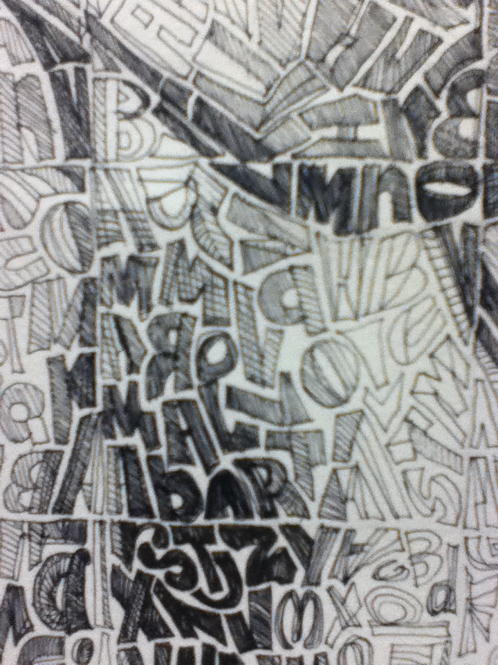
Self portrait illustration made of typography.
Self portrait illustration made of typography close up.
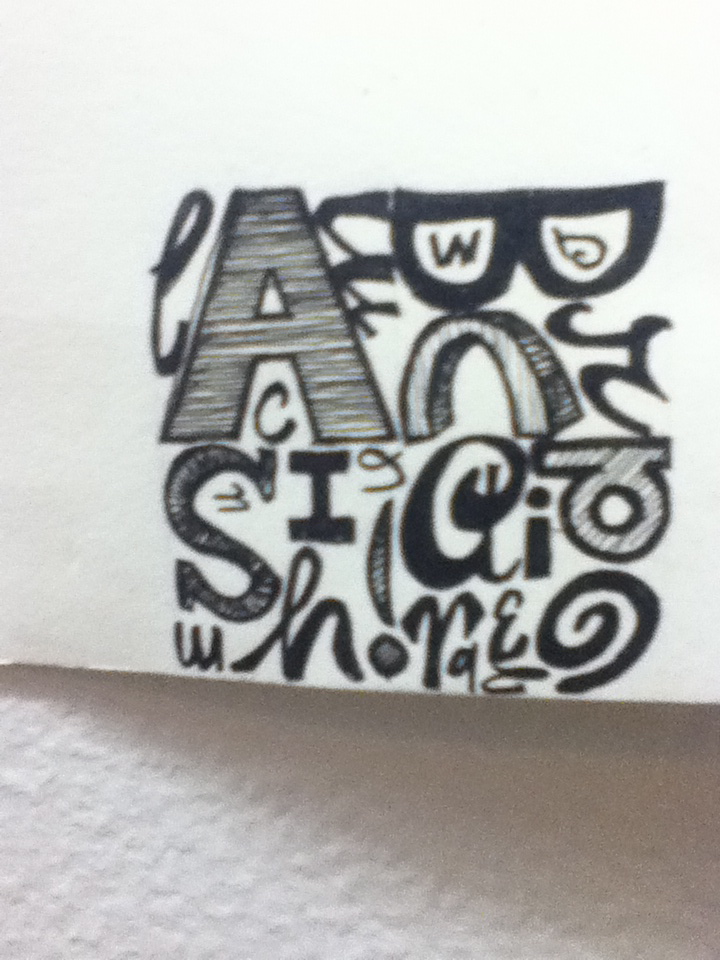
Self portrait signature made of unique typography that is like a 'new" vision of where logo design may step into.
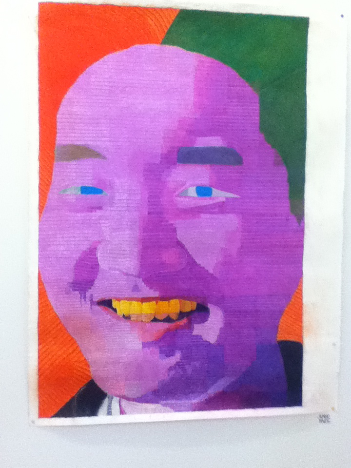
Self portrait illustration with surprising color.
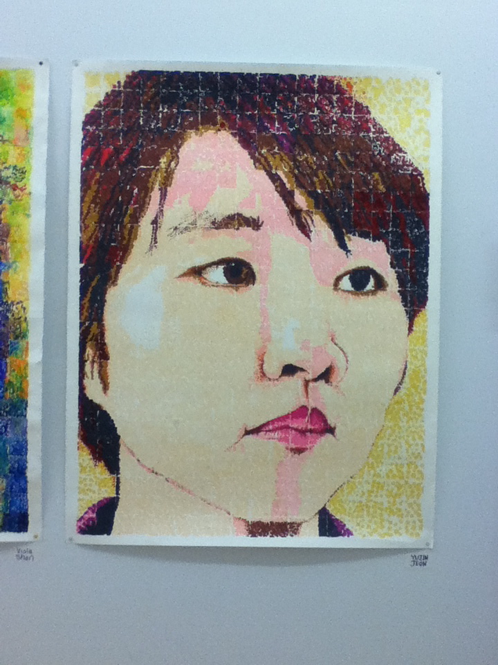
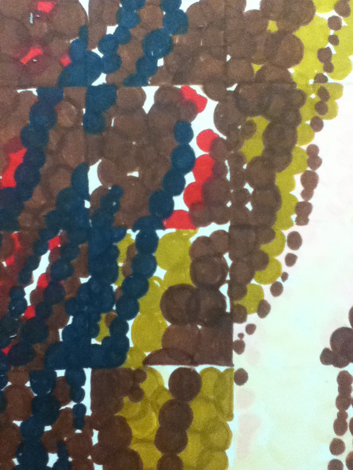
Self portrait illustration using dots.
Self portrait illustration using dots close up.
Self portrait illustration using dots.
Self portrait illustration using dots close up.
Tracy Holdeman is Executive Creative Director OF Insight Design Communications. Tracy is one of the top logo designer in the U. S. You can also fine more of his work at http://www.logodesignwichita.com/ and http://www.youtube.com/user/insightdesignusa


