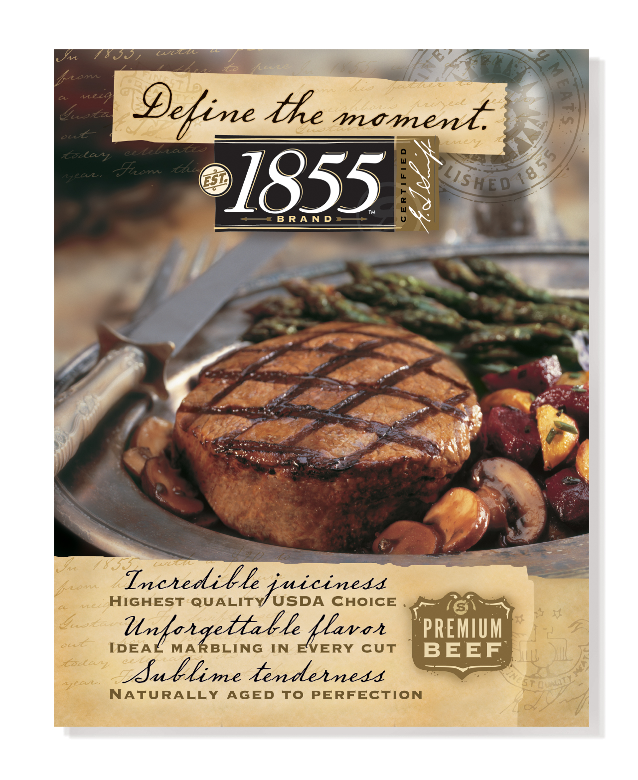
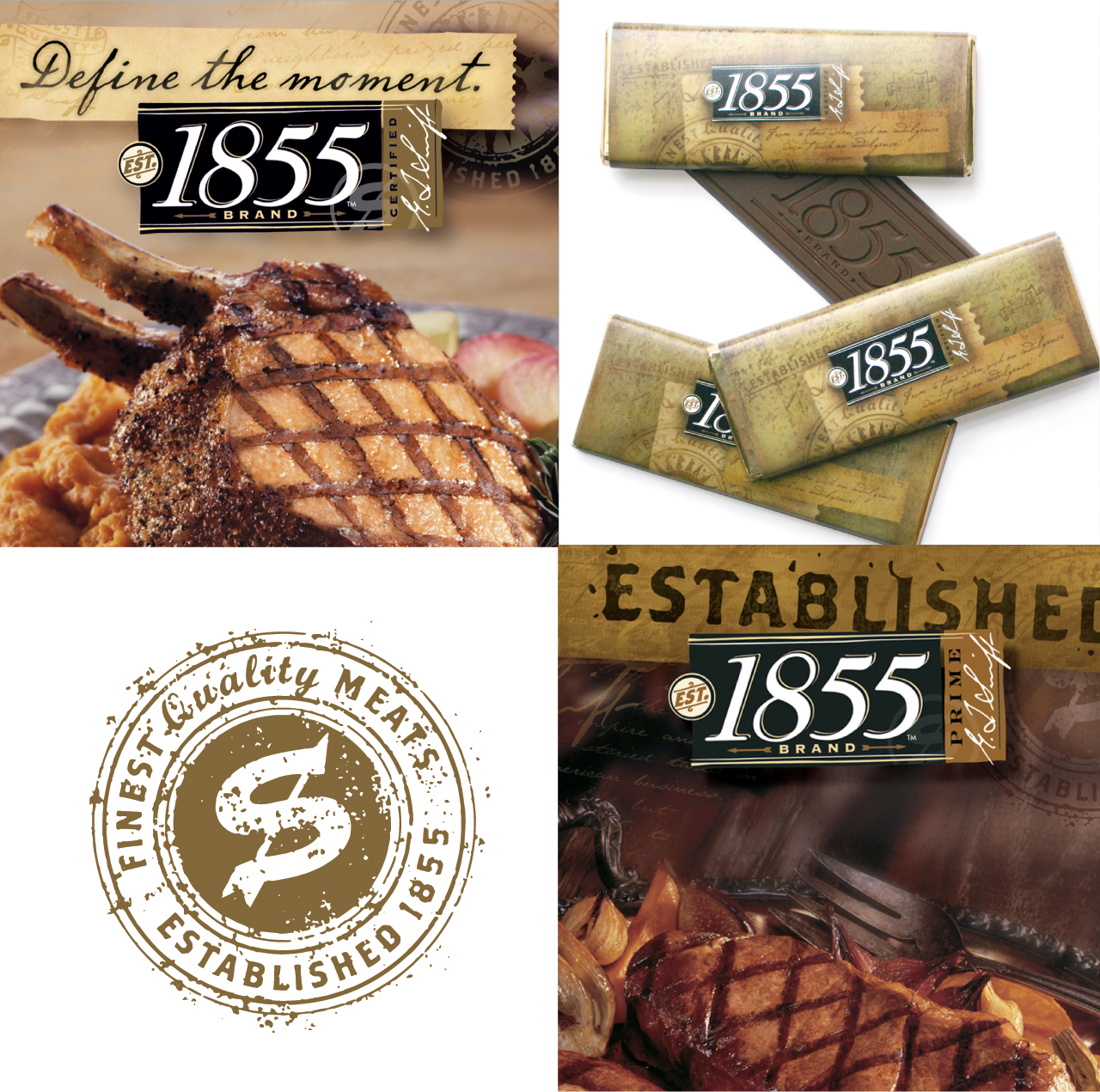
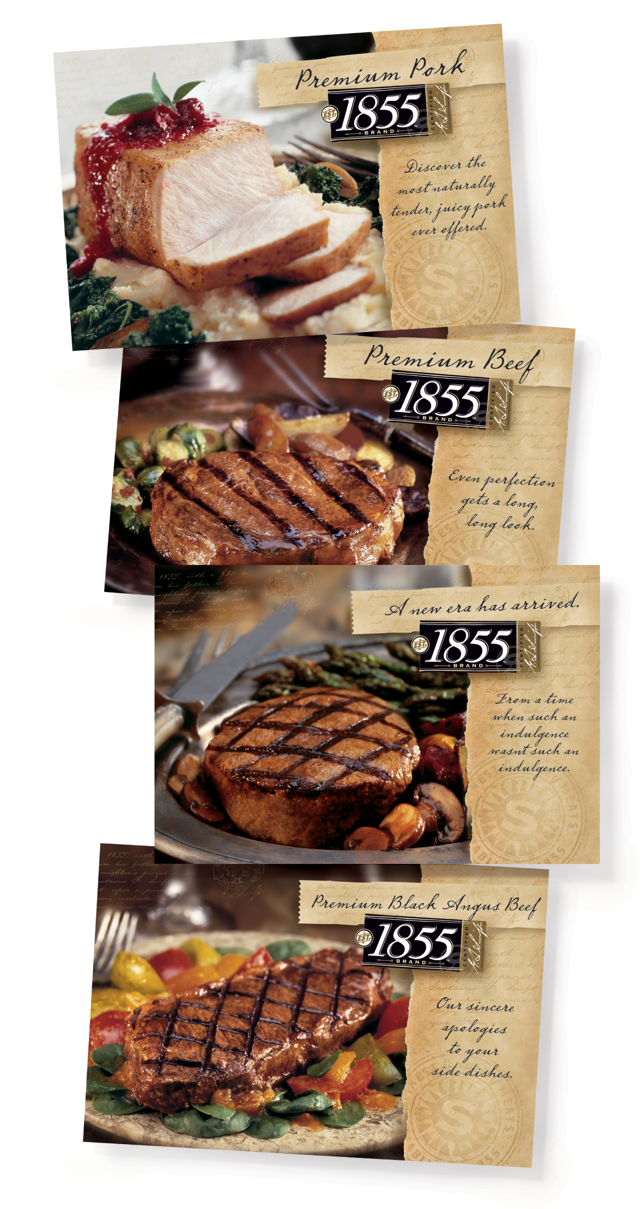
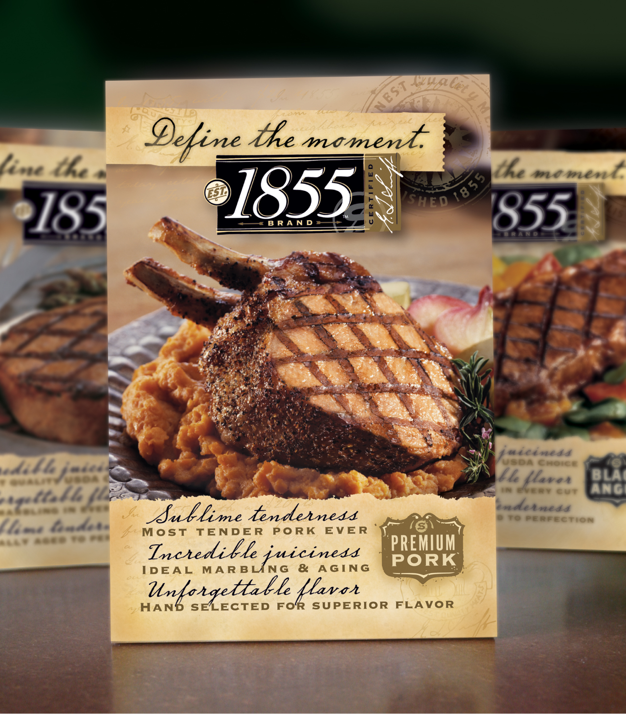
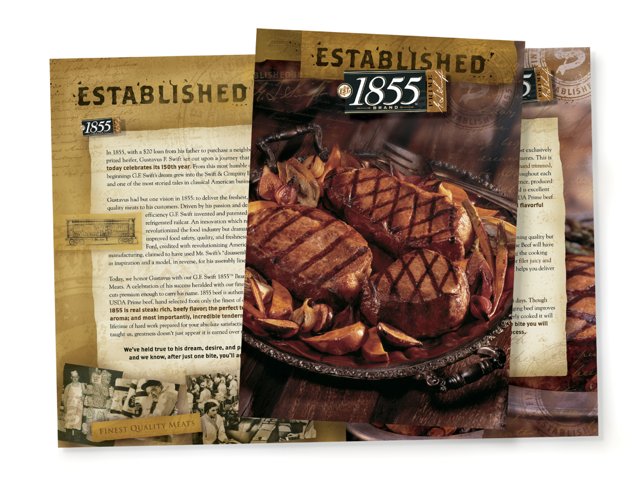
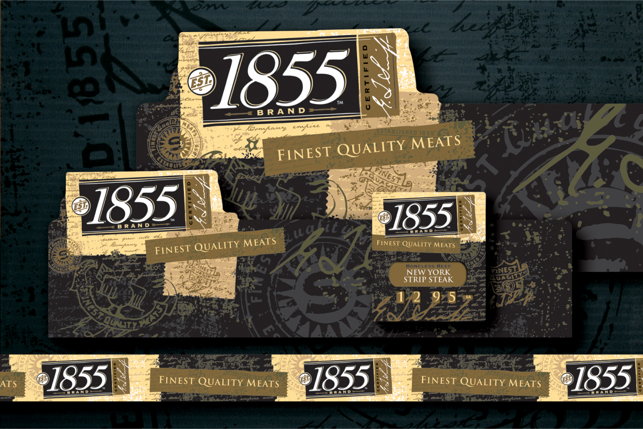
1855 Brand Meats
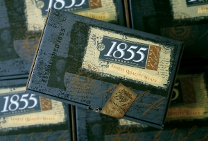
1855 BRAND
This is what Del Holzer, Vice President of Marketing , for JBS Swift & Company said, “It isn’t often that a single brand program can totally change perceptions of a company, its people, or products but it is safe to say that the 1855 Brand design work is doing just that. Already we have secured wins with Halperns, Rastelli’s, Freedman / Sysco. These four companies are huge players with tremendous reputations and successes in the industry - with their business, the ripples from the 1855 Brand launch have become waves.”
1855 Brand Development:
logo, identity manual, photo design and art direction, propping, website, retail hanging signs, case dividers, case headers, pricing wheel, case sliders, social media, labeling, food service direct mail, table tents, take-out box, aprons, hats, shipping packaging, special event awards and materials, advertising for print, bus graphics for the New York City market, print material, fleet graphics, billboards and even a candy bar.

Tracy Holdeman has done a fantastic job for me on logo and web design projects for several early stage ventures.
Thank you Scott,
I always admire your ability to see into the future and formulate a business out of thin air.
Logo Design Insight
Your logo design must work on your website.
If you haven't noticed everyone and every company has a website. It is the marketplace. We think of "The Web" as website designs viewed on a computer screen but in reality more website views accrue on smart phone than on traditional computers. What does this mean for your logo design? It means most of the latest trends in logo design will guarantee your logo will not work in it's most viewed context, your, website with a smart phone.
Logo design is best when thinking is first applied.
Most of the latest logo design trends lean on computer technology rather than thinking power. There are so many logo designers now. Per capita we have more logo designers than ever before in the history of the U.S.A. You can get 30 designers doing 20 different designs in three days for only $29.99. or some outrageous scenario. But what kind of logo design do you get? You get a lot of computer trained designers that use technology gimmicks rather than the power of thought. Yes I can easily make a bee hive out of geometric flowers that are blowing in the wind, but will anyone be able to see in on a website, website banner ad or smart phone for that matter. Computer technology makes an abundant array of techniques possible now but it doesn't make them smart logo designs.
Logo design questions you might want to ask your brand strategist or graphic designer.
Can my logo design work as a favicon?
Can my logo design work as a button graphic?
Will that "cool" pattern, sleek transparency, or all those little geometric shapes be visible small, viewed on a smart phone?
When someone does see my logo design, what will it mean to them?
Insight Design Communications is one of the most award winning logo design studios in the world. We have received over 20 international awards for logo design from just Graphis alone.
Learn more about our thoughtful logo design work at
LogoDesignWichita.com and youtube.com/user/insightdesignusa are website designs ©Tracy Holdeman
Logo Design Styles

Figural logo design
Figural logo designs might be the most used images in all logo design history. Figural logo designs were most popular in the first half of the 20th century before computers and when drawing skills were highly advanced. In recent decades figural logo designs have disappeared from the graphic design landscape because few designers have the drawing skills to create figural logo designs. Therefore, a figural logo can be a unique and effective logo design approach for any brand identity.
The figure is used to represent the abstract concept of all artist. The figure is raising up a star which symbolizes the idea of art. The figure raising the star shows the artist hanging his work to share with the world. The confetti and streamers running through the figure and the star symbolizes a celebration in the process of the artist sharing his art. He is raising art and it is that act that also raises spirits. It's a celebration of the uplifting effects of art.
Client: Wichita Art Museum event logo design
Industry: Arts & entertainment logo
Style: Figural logo design
Location: Wichita logo design

Wordmark or signature mark logo design
Not all logo designs are made with images, some are made with texts and images while others are simply text. A logo design that is only text is called a typography logo, logotype, word mark or signature mark. The type can be very straight forward or illustrated to communicate a specific feeling or attitude. A typographic logo can use a common font purchased from a font house, a modified font, a hand drawn graphic design font or a computer illustrated font. We rarely use a purchased font for a logotype because anyone can purchase the same font and use it. On the other hand, a specially created font will be unique in the marketplace and be better protected by copyright laws.
Squeezer's Palace is a re-creation of a 70's ice cream store. We developed typography for the logo based on historical 70's fonts. We hand illustrated the logo letterforms to match the essence of the original hand drawn logo. Redesigning the letterforms also allowed us to make the logo more compact and there fore more legible as store signage.
Client: Squeezer's Palace logo design
Industry: Restaurant logo design
Style: Typographic logo design
Location: Wichita logo design

Initial logo design
Logo designs that use company initials have been common from the beginning of graphic design, branding and even today in our website design world. An initial logo design is simply a logo that uses the initials of the company name. The key to this common type of logo design a successful logo is developing a truly unique image that holds visual interest.
Shallow Valley Foods uses the "S" and "V" from Shadow Valley. The 'S" is a geometric and three dimensional ribbon weaving in and out of the "V". The three dimensional effect is done without the use of gradations for better printing and visual impact on virtually any application. The 3D illusion is created with white space to to show one element in front of the other and two shades of red to show depth. The combination of weaving and depth create a visually memorable logo design.
Client: Shadow Valley logo design
Industry: Food service logo design
Style: Initial logo design
Location: Wichita logo design

Character logo design
A character logo uses a face or figure in an exaggerated illustration style to tell the most impactful story possible. Character logo designs are most commonly used for major sport franchise logo designs and even local small town sport team logo designs.
The Central Raiders logo design is a character logo illustrated to endow the bandit, the mascot, with extra toughness and meanness. The bandit has been the school mascot for over 50 years so he was maintained as the logo. Elements were added to the bandit such as the hat with the letter "R" and the handkerchief to be sold as merchandise and add extra fan excitement at sporting events.
Client: Central Raiders logo design
Industry: Sports logo
Type: Character logo design
Location: Logo design Wichita, Kansas

Animal logo design
Animal logo designs are ancient history in graphic design terms, but as in any endeavor, creativity and a unique perspective applied to tried and true concepts can make a very impressive visual statement. Animals allow for virtually any expressive idea and are universally understood.
The Surfing Bull concept restaurant logo design is a remix of the old boring "Surf and Turf" terminology. Surfing Bull is a steak and seafood restaurant. The logo illustration is based loosely on Cubist drawings by Pablo Picasso which embodies the logo design with a funky alternative look and feel. The bull is actually surfing, riding a wave. The surf board cleverly illustrates the water with it's bottom line.
Client: Surfing Bull logo design
Industry: Food and drink logo design
Type: Animal logo design
Location: Logo design Wichita graphic design

Crest logo design
Crest logo designs are a derivative of the old world "coat of arms". A coat of arms is a unique heraldic design on a shield or escutcheon or on a surcoat or tabard used to cover and protect armor and to identify the wearer. Thus the term is often stated as "coat-armor", because it was anciently displayed on the front of a coat of cloth. The design is a symbol unique to an individual person, and to his family, corporation, or state. Such displays are commonly called armorial bearings, armorial devices, heraldic devices, or simply armorials or arms. Today we use this concept for logo designs.
Client: Carlos O'Kelly's Mexican Cafe vender event logo
Industry: Restaurant logo design
Type: Crest logo design
Location: Wichita logo design

"Modern" logo design
A modern logo design could be almost anything but in the big picture a modern logo is simple and usually literal but heavily stylized with a new typographic feel. The shapes are easy to draw on a computer and consist of geometric shapes cleverly assembled.
The GoJoe's logo design is a steaming cup of coffee held by cupped hands. Hands that seem to hold the cup of coffee with great care and concern as if GoJoe's coffee is special and ready to go. The steam is made of dots that are extrapolated onto other elements of the brand and graphic design. The colors are a modern combination of a toxic blue and a traditional brown.
Client: GoJoe's logo design
Industry: Food and drink logo
Style: Modern logo design
Location: Wichita logo design

Simple logo design
The logo design is two arrows interacting with the negative space creating an “N”. The simplicity is what makes the brand logo engaging. The consumers eye and mind fills in the empty space, like a light bulb turning on inside the brain the viewer realizes the logo has just acted out the company name.
Location: Logo design Kansas City
Style: Simple logo design
Industry: Technology logo design

Illustrative logo design
The Stables is a creative collective housed in a renovated horse stable originally built in 1929. The logo shows a hard working blacksmith pounding an iron to create. From the figures powerful strike comes forth an explosion of light and creativity complete with a © copyright symbol made from a horseshoe.
Location:Logo design Wichita kS
Style: Illustrative logo design
Industry: Business service logo design

Abstract logo design
LifeVentures offers educational classes and programs for seniors. The educational programs and events include speakers, classes and with every event, class or speaker many seniors naturally gather together making every event a social event. The logo depicts these aspects of the nonprofit organization but moreover the logo is a metaphorical “Tree of Life”. A place to learn, grow and come together.
Location: Logo design Wichita KS
Style: Abstract logo design
Industry: Senior Care logo design

Conceptual logo design
The Anvil logo design is purely conceptual. Anvil is a business created to create new businesses. Like an actual anvil is a tool used to create other tools. Anvil is a metaphor. The brand visual is two steps of an infinite pattern that diagrams infinite creation. For example, the center circle is surrounded by a circle of dots. That (center circle surrounded by a circle of dots) is repeated at the red dot. If the pattern is extended out it would repeat into infinity. The Anvil logo is a perfect example of design style matching the company profile. The idea of the company is conceptual so a simple and clean design puts the idea, the concept, in the forefront. An illustrative or complex logo design would distract from the conceptual meaning of the logo.
Location: Logo design Wichita, kS
Style: Conceptual logo design
Industry: Technology logo design

Typographic logo design
For the Timberline Steakhouse and Grill logo design we developed a hand drawn woodcut illustration and graphic design style to match the name and casual eating concept and restaurant atmosphere of the brand. Illustrating the typography made it possible to use large readable type for signage while also giving the logo design an engaging character and style.
Location: Logo design Wichita KS
Style: Typographic logo design
Industry: Food and beverage logo design
Blend & Grind logo design

Blend & Grind is a smoothie, coffee, and juice bar located in the downtown area of Raleigh, NC. The store front is located in a high end "shopping center" with an upscale industrial feel (wood and metal). Blend & Grind appeals to the young modern customers that go to the local colleges as well as the older wealthier customers that live in the area. This logo is a circle divided into four parts: steam from coffee, juice squirting and two gears one represents a coffee cup and the other an orange. The leaf on top helps visualize the idea of an orange and signals a healthy choice to consumers. Logo Design Raleigh, NC. By Tracy Holdeman
Logo design by Insight Design Communications


