Conrade Insurance Group Website Design

CONRADE INSURANCE GROUP WEBSITE DESIGN:
Conrade Insurance Group website design has a dynamic home page that connects Conrade Insurance Group's three main intentions: Possibilities, Values and Success. The brand and soul of the company is living and breathing with interactivity in the responsive website design.
Conrade Insurance Group Website Development:
Conrade Insurance Group Website Development and Digital Branding: Website design & development | SEO structure | Built-in e-mail marketing | Client portal | Responsive and mobile website | Icon design and illustration | Logo design and brand development.

Responsive Website Design

Mobile Website Design


SEO Website Design
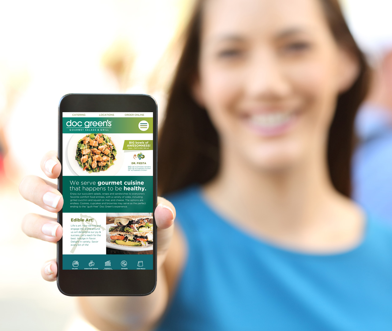
Doc Green's Wichita Website
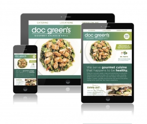
DOC GREEN'S WEBSITE DESIGN:
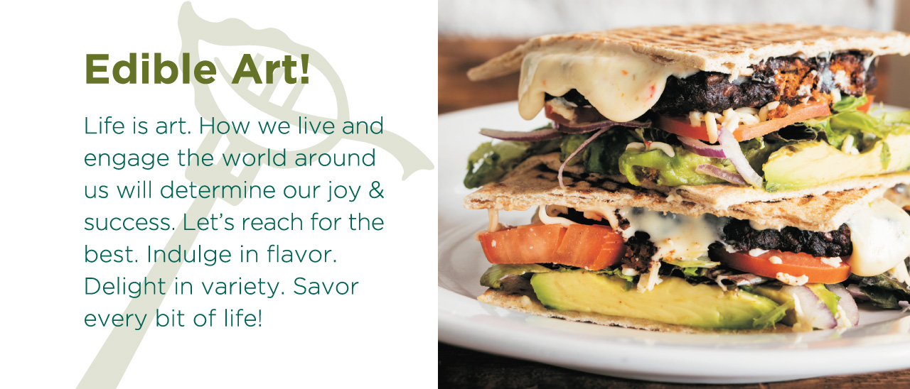
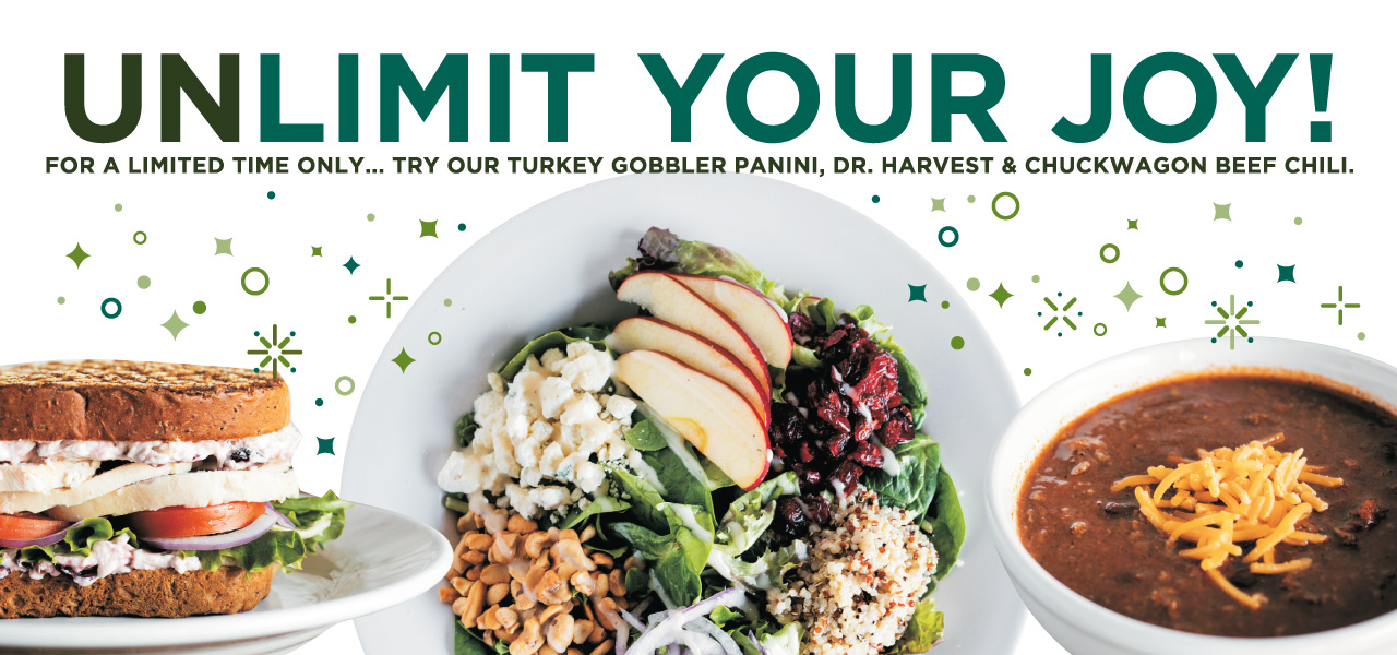
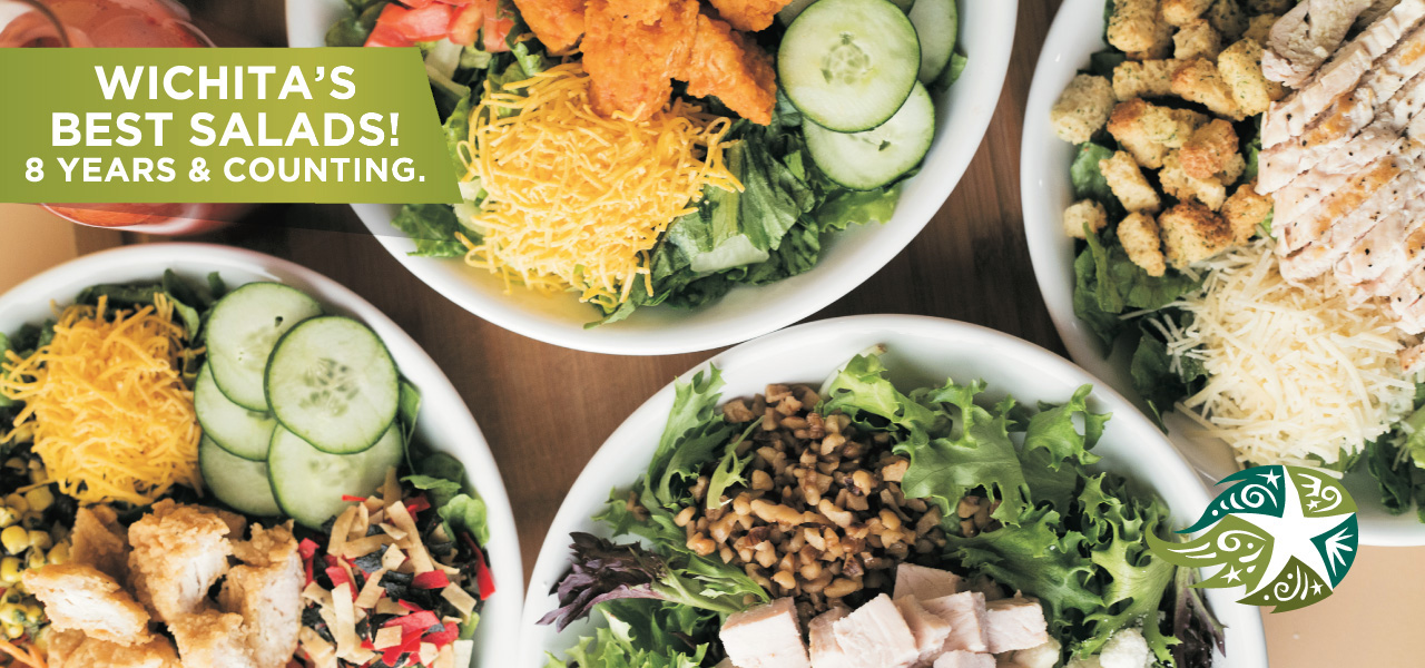
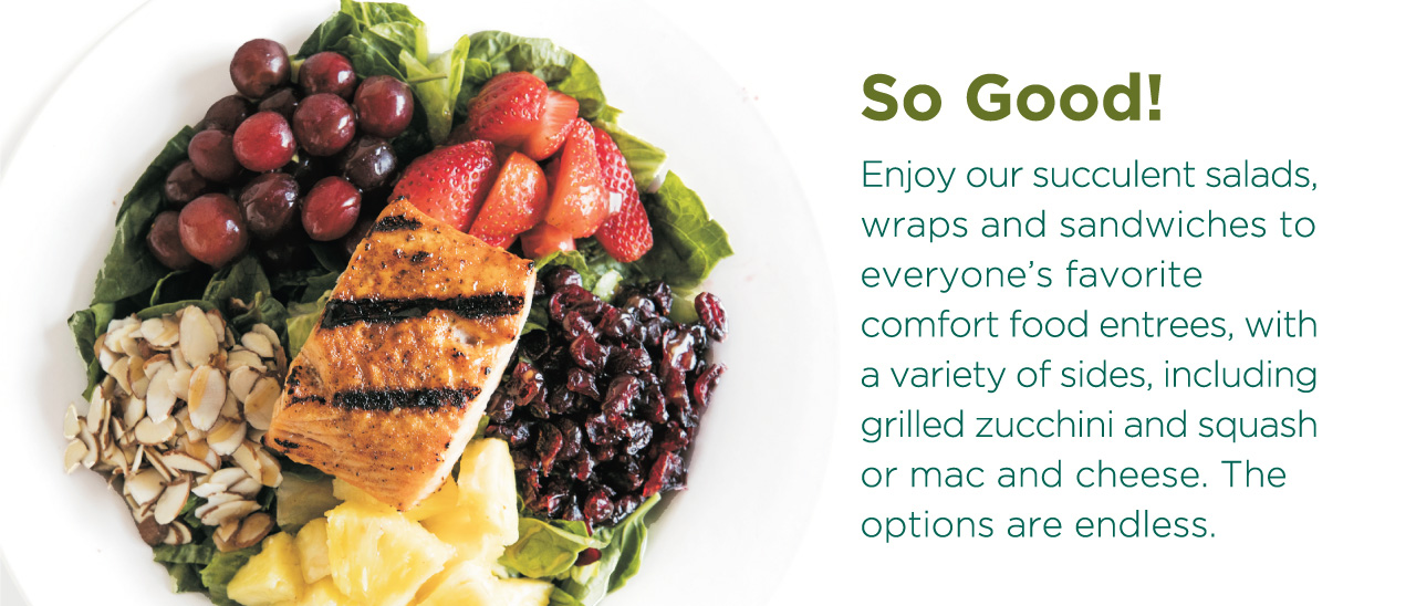
Doc Green’s of Wichita serves gourmet cuisine that happens to be exceptionally healthy. Their custom website design features a food menu that includes amazing salads, wraps, paninis, soups, salmon and even steaks. The website also enables on-line ordering and delivery.
Doc Green's Website Development:
Doc Green’s Website Development and Digital Branding: Website design & development | SEO website structure | Built-in e-mail marketing | On-line ordering | Responsive and mobile website | Icon design and illustration.

Responsive Website Design
Mobile Website Design
Award Winning Graphic Design

Social Media Friendly Website Design
Award Winning Website Design

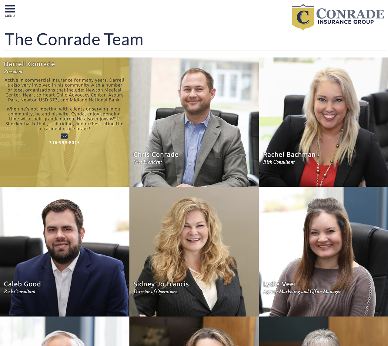
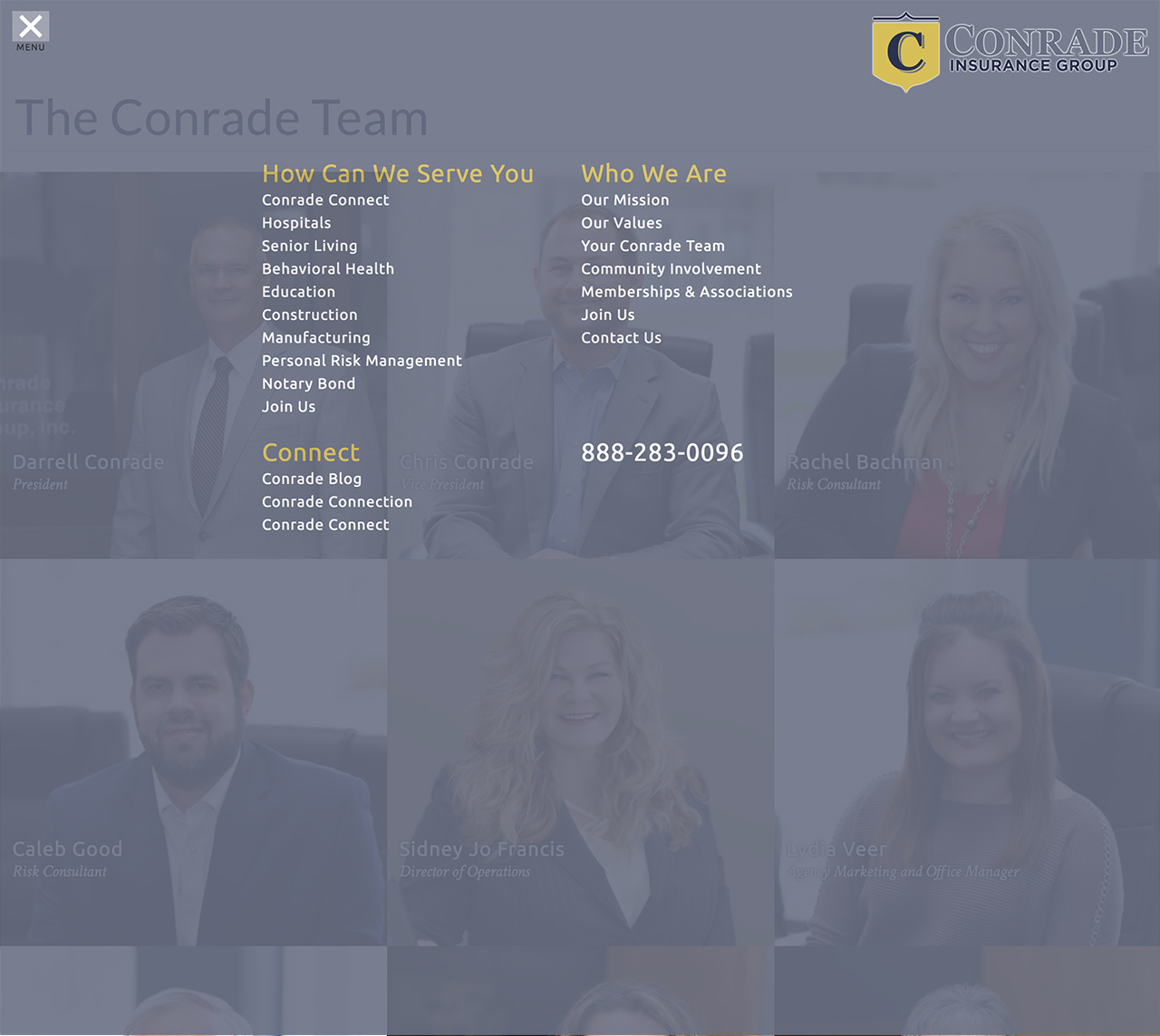
Conrade Insurance Group
"Our new website design went live yesterday and we can’t wait for you to check it out! We’ve had so much fun working on our website with Tracy Holdeman and his team at Insight Design in Wichita. We think they’ve done an incredible job developing our website! Let us know what you think! www.conradeinsurance.com
Thank You!
Chris, Lydia, Sidney, Martha and Rachel. We really enjoyed working with you all. Love your energy and having a lot of fun while doing great work together!
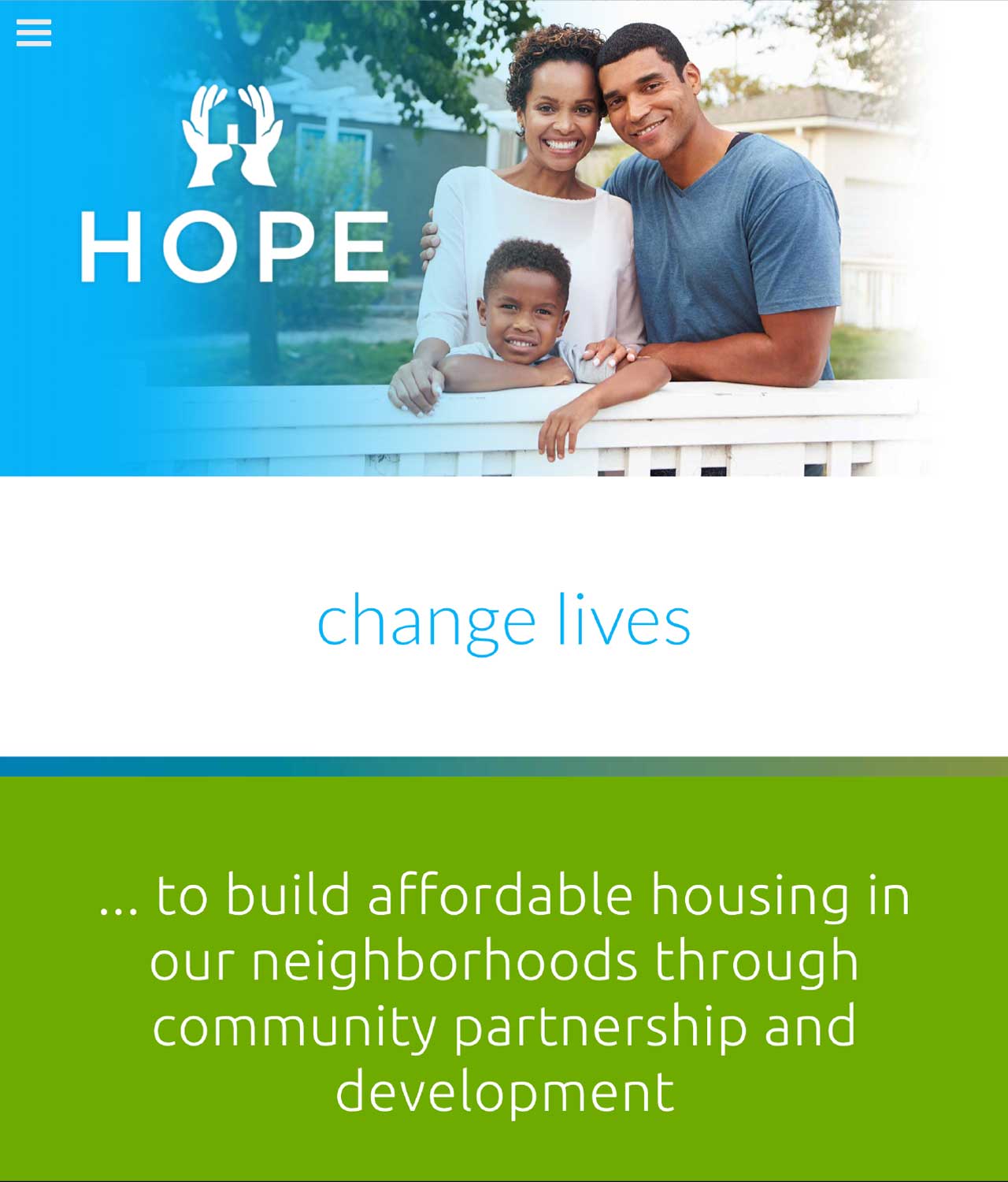
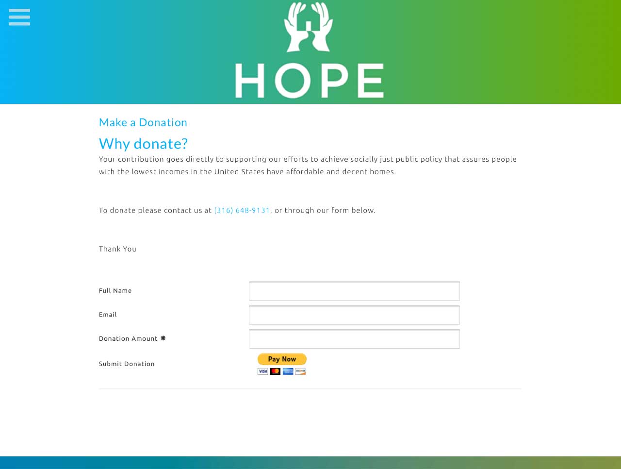
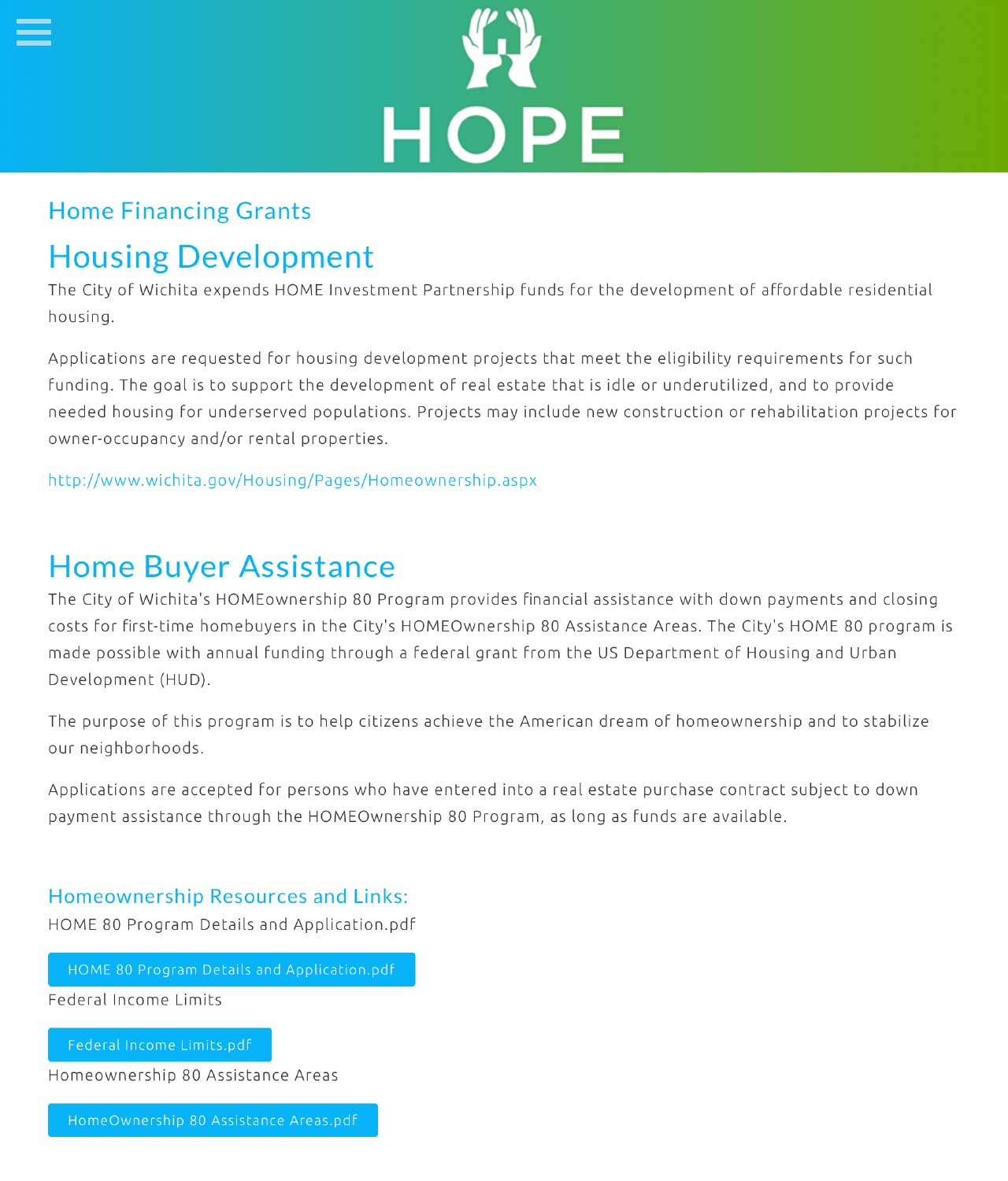
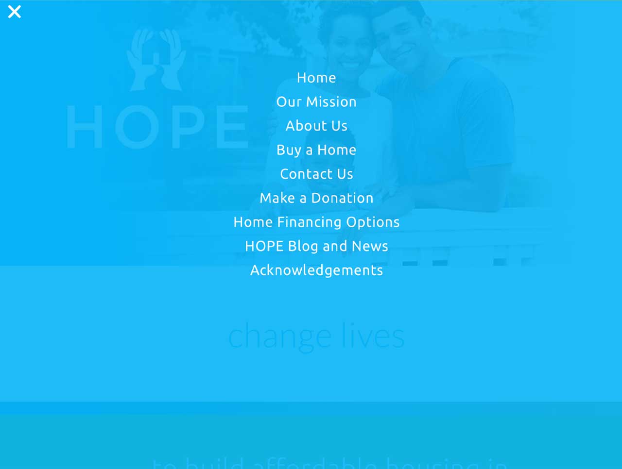
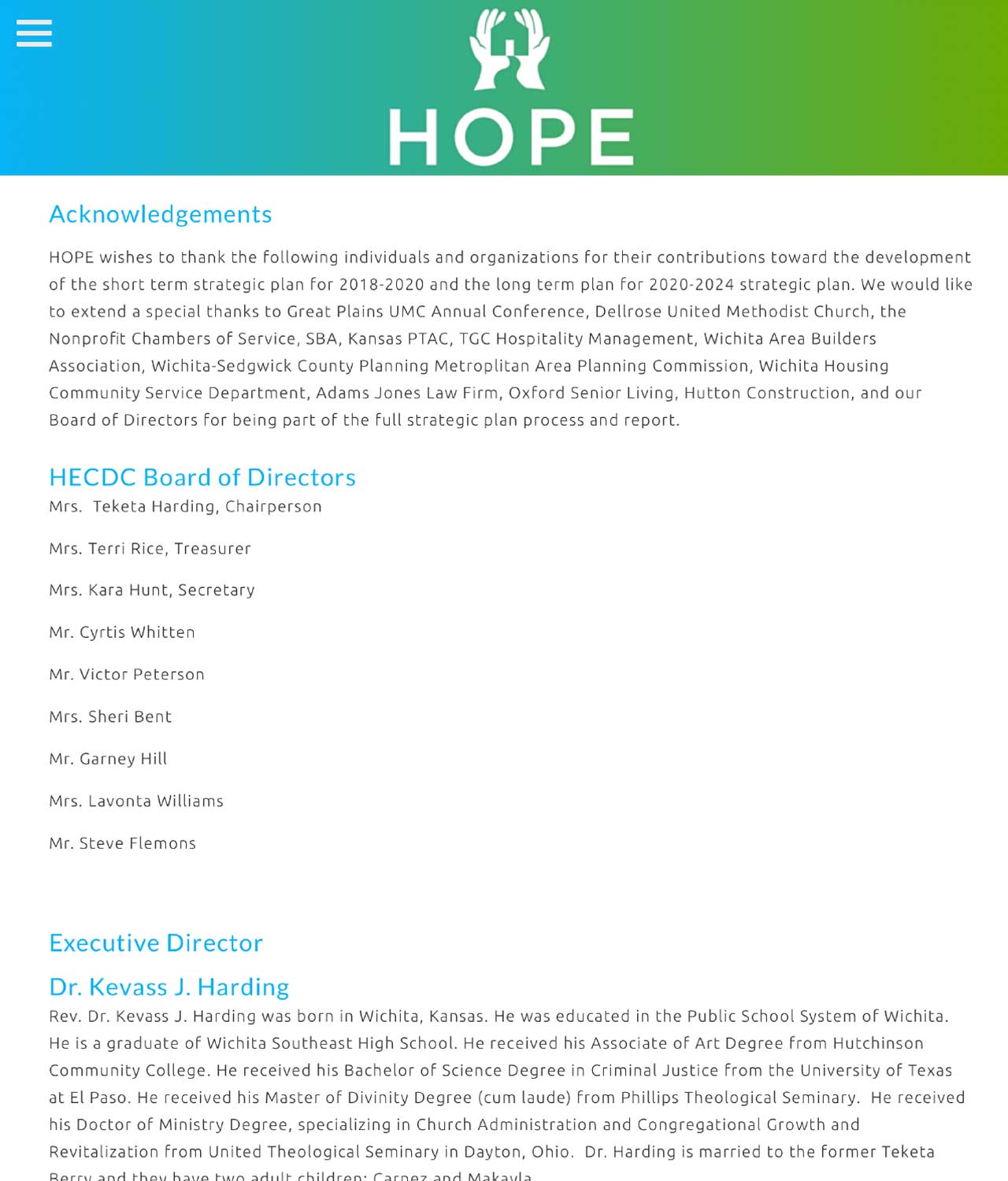
Wichita Website Design for HOPE

HOPE WEBSITE DESIGN:
HOPE (Helping Other People Excel): HOPE assist the economically disadvantaged with financial education and financial support to become home owners and enjoy more stable families and more productive lives. To complete the circle, HOPE builds high quality and ecologically efficient homes in forgotten and struggling communities.
HOPE Website Development:
Website design & development | SEO structure | Built-in e-mail marketing | Dynamic graphs HOPE Branding: Logo Design | collateral material | Website design & development
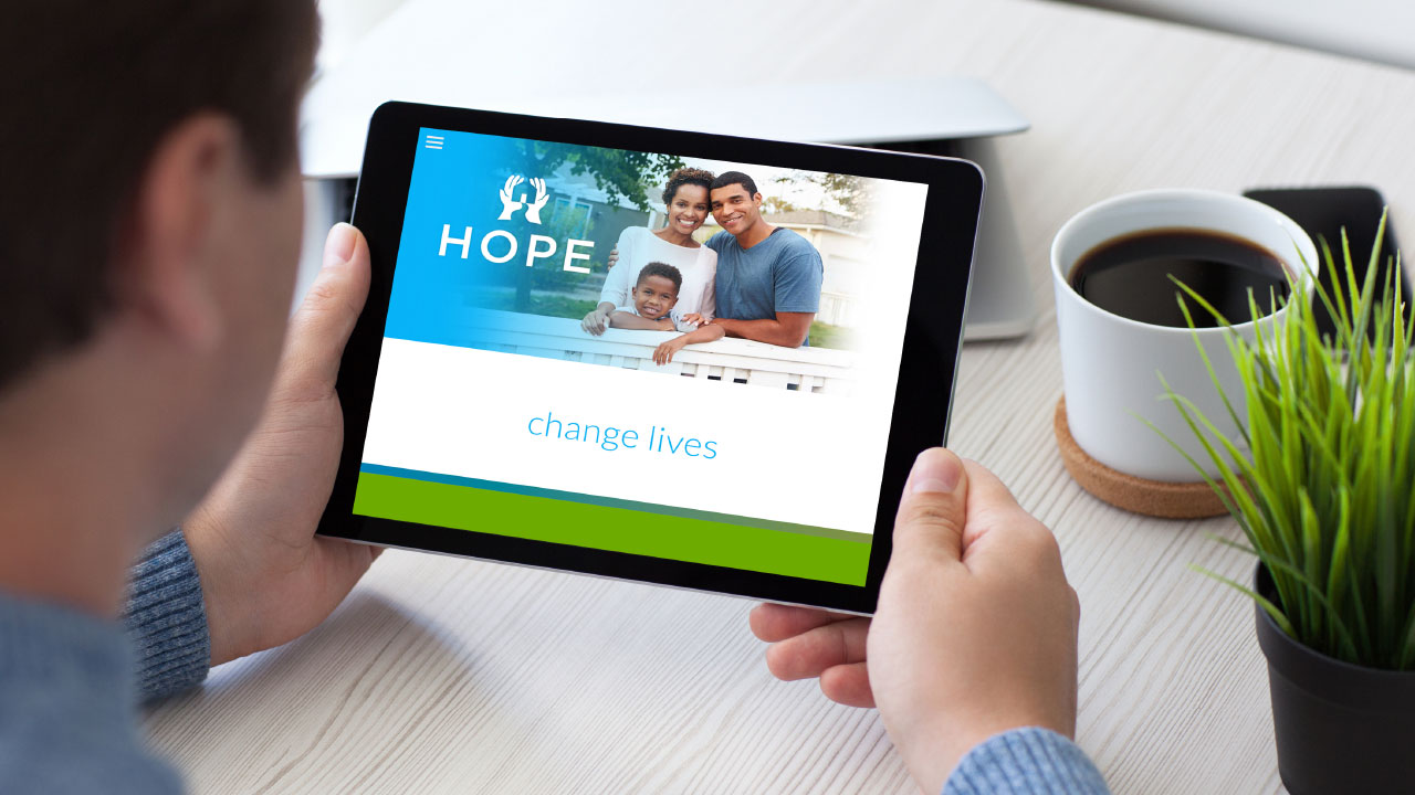
Website Home Page
Donate to Help Change Lives
Access to City Grants and Assistance
Website Menu
Executive Director and Board
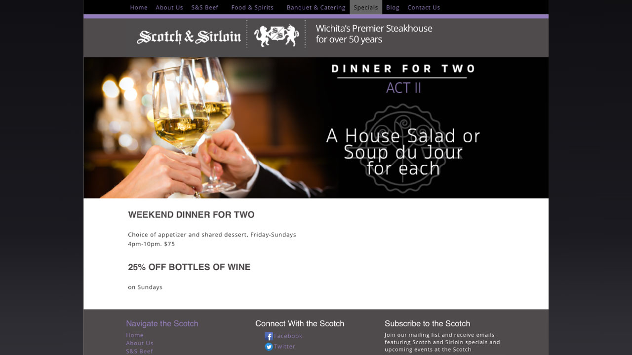
Scotch & Sirloin Wichita Website Design
SCOTCH & SIRLOIN NEW WEBSITE DESIGN COMMING SOON:
Award-winning steakhouse since 1969. The newly remodeled Scotch & Sirloin is home to the largest wine wall in Kansas, premium steaks from Sterling Silver Meats and the biggest selection of scotch in the city of Wichita.
Scotch & Sirloin Website Development:
Website design & development | SEO structure | Built-in e-mail marketing | Dynamic graphs
Scoth & Sirloin Branding: Logo Design | collateral material | Website design & development

Responsive
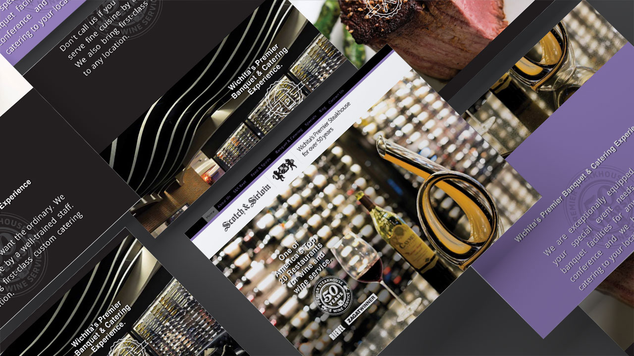
Specialty Pages
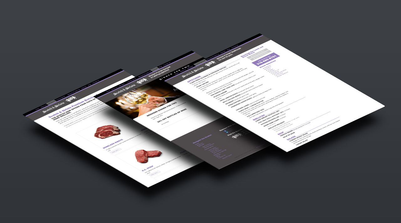
Online Menu Website Information
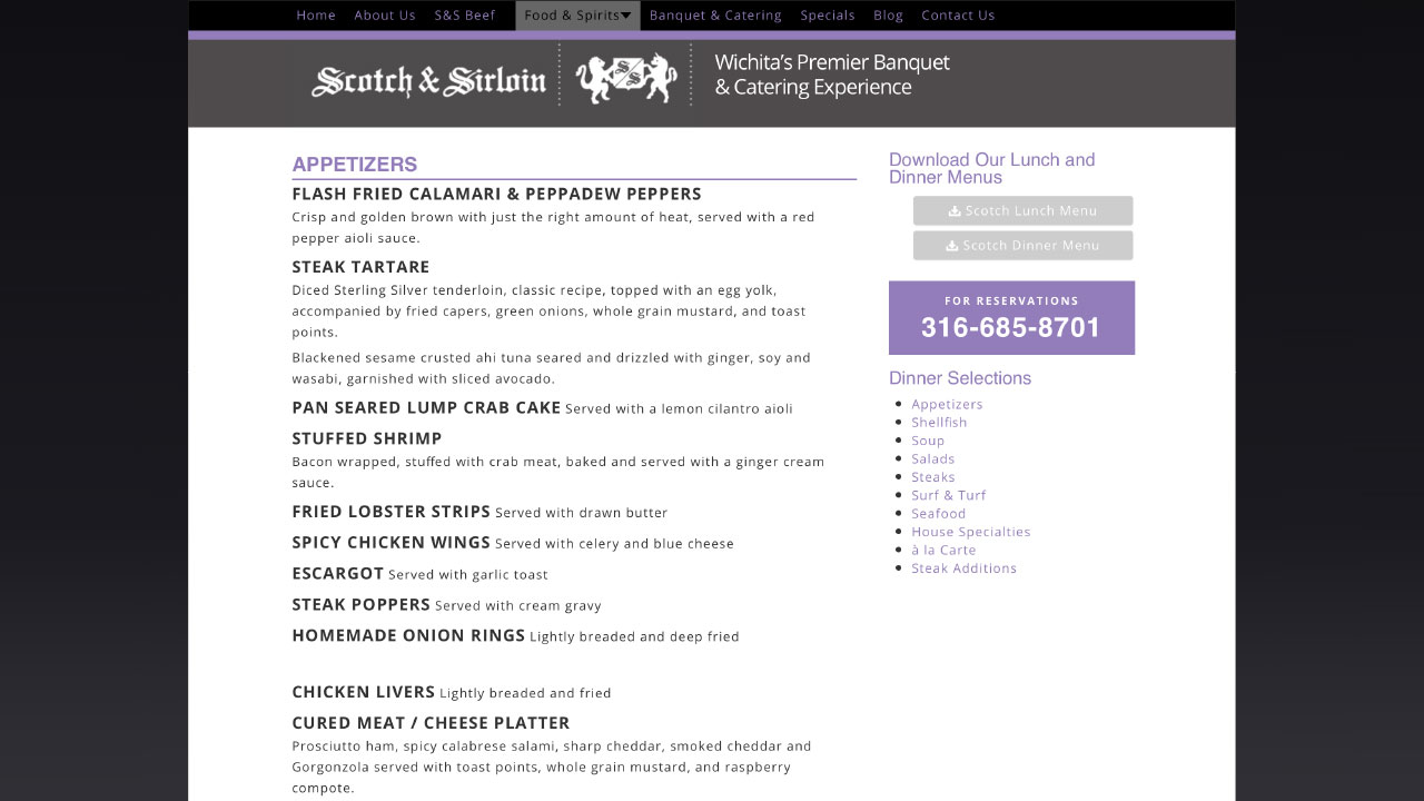
Dynamic Graphs
![]()
Beyond Napa corporate identity logo design applied to signage.
Creativity within the confines of simplicity can be the most difficult logo designs to develop. But, they can also be the best brand logos if the logo concept is also unique and engaging. The Beyond Napa logo combines two different elements, grapes and a cork screw. The two simple images are integrated by the cork screw which also appears as the stem of the grape vine. This interplay of images creates unique visual interest that holds the eye and communicates both wine and wine accessories. The cork screw / grape vine turning into the grapes implies authentic and pure wines. It also shows the interplay between the two aspects of the company, wine and wine accessories. The logo design also embodies an upscale Deco feel that fits perfectly with the Old Town District and the Plaza in Kansas City.

Beyond Napa brand logo for one color print on white background, Logo Design Company, Insight Design Communications, Wichita, KS.
![]()
Secondary use brand identity logo design.
![]()
Beyond Napa corporate identity logo designed for one color print on PMS 155 background.
![]()
Secondary use Wichita Kansas logo design for PMS 155 background.
![]()
Beyond Napa Kansas logo design reversed.
![]()
Secondary use logo identity for reverse image.
Beyond Napa is a wine and wine accessory boutique in the Old Town district of Wichita, Kansas. The boutique offers wine by the bottle and sophisticated wine accessories for discerning clientele. The brand logo is a cork screw, that also looks like a vine twisting into a graphic representation of grapes. The logo identity design communicates wine but also wine accessories in one instant visual.
The Beyond Napa Logo illustrates the cost saving value of a smart, creative and simple logo design. The entire corporate identity is anchored by this simple and intelligent logo design which engages consumers in any medium; interactive website design, three dimensional environmental signage, business print and flexographic print packaging.
![]()
Wichita logo design used in brand website design
![]()
Kansas logo design used in brand packaging design
Logo Design Wichita, KS – Tanya's Soup Kitchen
http://www.youtube.com/watch?v=73wiBugaNX0
The Tanya's Soup Kitchen logo design is the image of Tanya Tandoc and a bowl of soup in the same image. The Tanya's Soup Kitchen logo design is a visual metaphor to show Tanya is the equal of a true artist. Tanya puts herself into her creations, her art, her soup.
In the logo design Tanya's face is the bowl, her mouth is the spoon, her eyes are splashes/droplets and her hair is the steam. All the graphic design shapes and lines of this logo where drawn and redrawn, then scanned into digital form and re-drawn digitally. All the graphic design edges and curves were smoothed and softened to invite the viewer and remind the consumer of how beautifully delicious Tanya's soups really are.
Tanya and the Tanya's Soup Kitchen logo design and graphic design brand identity have become interchangeable, recognized as one-in-the-same. Her website design and Facebook persona allows Tanya to share her unique attitudes with her many fans and friends. All the graphic design in Tanya's brand identity reflects and has become the symbol for Tanya's amazing personality. Tanya has become more than a proprietor of a sheik restaurant, she has become a food goddess and a beacon for sub-culture lifestyles and attitudes. The early lines anticipating a bowl of Tanya's amazing soup often extend from one side of the restaurant to the other and even out of the door. Tanya has become famous in the Wichita area and well know in the highest perches of the food industry.
This brand identity video includes; logo design, website design, environmental and print.
oin the attitude at
http://www.facebook.com/tanyassoupkitchen
http://www.facebook.com/tanya.tandoc
http://tanyassoupkitchen.com/
Tanya's Soup Kitchen is located at: 1725 East Douglas Avenue Wichita, KS 67211
Tracy Holdeman is founder and creative director of Insight Design Communications, executive creative director of WhisperNewYork. His logo design, brand identity, website design and graphic design work has been recognized with over 100 national and international awards.
Insight Design Communications has been honneres with over 100 international awards for logo design, graphic design and brand identity design.
You can see more of Tracy Holdeman's graphic design work at Logo Design Wichita


