HomeGrown Logo Design
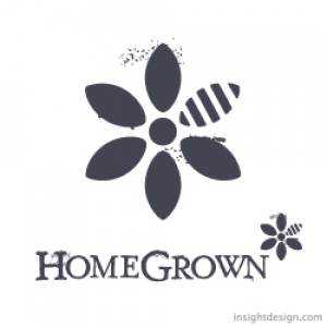
HomeGrown brand is a healthy and locally sourced restaurant that also serves alcoholic drinks in the AM.
HomeGrown logo design is a flower/bee/the natural process of life and food.
HomeGrown Apparel Logo
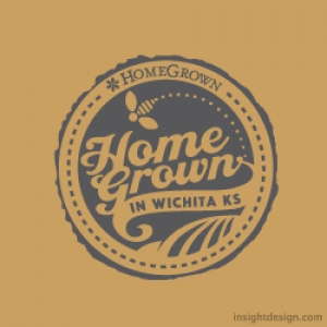
HomeGrown brand includes apparel like hats and t-shirts that are sold in-store.
The HomeGrown apperal logo was designed to work with silkscreen, embriodery and as a patch.
Great Logo Design & Branding #2
#2. The ability to design type in any style.
A great logo design studio should have the ability to employ a variety of typographic solutions and the capability of creating a new type font. Font creation can be the key element that separates your logo from the crowd. Scroll down to see examples.
The QuickerTek logo type has a modified font. The stroke weight was increased to achieve a bolder look than the original font. The letter height was also increased. QuickerTek is a national brand.
![]()
The Old Town brand type was altered to create a more energetic feel than the original font. The stroke wieghts were varied, straight lines were skewed and different letter sizes were mixed together to give the design a bold, vibrant and fun look.
![]()
Timberline’s brand logo typography was designed and illustrated by hand to achieve a real woodcut look. This brand logo design appears at restaurants in St. Joseph, Missouri, Kansas City, Missouri, Salina, Kansas and Wichita, Kansas.
![]()
The Foulston Siefkin logo mark or brand image is simple letter forms designed as unique shapes. The clean and simple typography creates a horizontal movement that counters the vertical push of the (FS) branding mark.
![]()
The WorkHorse Recruiting logo type is one of those cases where a font straight out-of-the-box worked. The serifs of the WorkHorse type point in different directions. The top serifs point backwards while the bottom serifs point forwards echoing the motion of the circle eight filigree.
![]()
The GooGoo Wonderland branding typography is a combination of type creation and a stock font. The GooGoo is created to have the exact same circle shape for the O’s and the G’s. The Wonerland type is a font.
![]()
The Cosmetic Cafe logo type is a hand drawn script to communicate a sense of authenticity and intimacy.
![]()
The StoneBridge brand type is an old version of Goudy, a classic, old world, font that works well with textural images of stone.
![]()
The AgriQuip logo typography is the font Interstate Bold with the “A” and the “Q” altered.
![]()
The Douglas Design District logo typography combines two fonts. The “Douglas” and “District” type creates a horizontal visual and the “Design” type creates a vertical movement matching the vertical and horizontal vectors of the brand image.
![]()
The Darbuka Brand Perfumes logo type design is a modern American font that has a strong Middle Eastern visual reference. The variation in the stroke widths and serifs relate to the henna scourced brand image illustration and design.

The Tumbledrum logo text is an Insight Design font developed from cirlces and rectangles.
![]()
The Arts Council logo design uses Microgramma Bold and Light. “Arts” is reversed out to make a point of emphisis. The alternating black boxes reference the four squares above which elude to diverse artistic expression. The typography is also distressed to integrate with the branding image.
![]()
The WaterBug brand type is hand drawn to mimick water shapes and the brand image illustration of the swimming waterbug.
![]()
Tanya’s Soup logo type is a combination of fonts that were both altered using Photoshop filters to follow the line qualities of the branding image.
![]()


