Wichita Real Estate logo
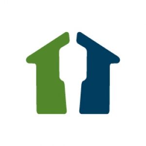
Wichita Real Estate logo is a website that eliminates realtor. The logo is a house with an invisible realtor in the center.
J. P. Weigand & Sons Realty Resurgence logo

The R logo references the idea 'resurgence" because after Covid Wichita, Kansas and Weigand were hoping to experience an economic resurgence.
Capital7 logo design

Capital7 logo design is the letter C and the number 7 that uses the angle of the 7 thoughout the brand. The name arrived from the number of partners.
Darren Ward's Personal Logo
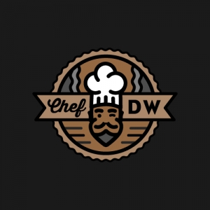
Darren Ward's Personal Logo depicts Darren as the great BBQ chef. His likeness has been reduced to it simplist forms.
SourceWood logo

SourceWood logo is an S made of arrows to signify sourcing from all angles.

SHALLOW VALLEY FOODS LOGO DESIGN
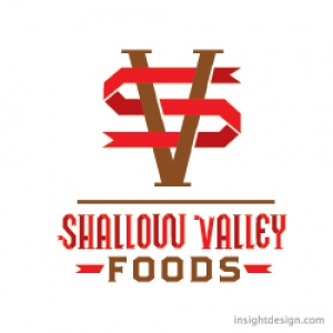
Shallow Valley Foods produces a variety of farm fresh dairy products like ice cream.
The logo design is entirely typographic.
HomeGrown Logo Design
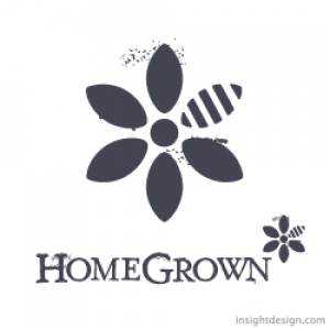
HomeGrown brand is a healthy and locally sourced restaurant that also serves alcoholic drinks in the AM.
HomeGrown logo design is a flower/bee/the natural process of life and food.
HomeGrown Apparel Logo
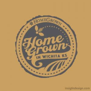
HomeGrown brand includes apparel like hats and t-shirts that are sold in-store.
The HomeGrown apperal logo was designed to work with silkscreen, embriodery and as a patch.


