SpeakEasy Distribution Logo Design
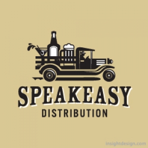
SpeakEasy Distribution Brand is alcohol wholesale and distribution.
SpeakEasy Distribution logo design is a 20's era wagon hauling king size drinks.
Horizon Wealth Management Logo Design

The logo design depicts the calm over turbulant waters as a metaphor about investment strategies.
Logo Design Insight
Your logo design must work on your website.
If you haven't noticed everyone and every company has a website. It is the marketplace. We think of "The Web" as website designs viewed on a computer screen but in reality more website views accrue on smart phone than on traditional computers. What does this mean for your logo design? It means most of the latest trends in logo design will guarantee your logo will not work in it's most viewed context, your, website with a smart phone.
Logo design is best when thinking is first applied.
Most of the latest logo design trends lean on computer technology rather than thinking power. There are so many logo designers now. Per capita we have more logo designers than ever before in the history of the U.S.A. You can get 30 designers doing 20 different designs in three days for only $29.99. or some outrageous scenario. But what kind of logo design do you get? You get a lot of computer trained designers that use technology gimmicks rather than the power of thought. Yes I can easily make a bee hive out of geometric flowers that are blowing in the wind, but will anyone be able to see in on a website, website banner ad or smart phone for that matter. Computer technology makes an abundant array of techniques possible now but it doesn't make them smart logo designs.
Logo design questions you might want to ask your brand strategist or graphic designer.
Can my logo design work as a favicon?
Can my logo design work as a button graphic?
Will that "cool" pattern, sleek transparency, or all those little geometric shapes be visible small, viewed on a smart phone?
When someone does see my logo design, what will it mean to them?
Insight Design Communications is one of the most award winning logo design studios in the world. We have received over 20 international awards for logo design from just Graphis alone.
Learn more about our thoughtful logo design work at
LogoDesignWichita.com and youtube.com/user/insightdesignusa are website designs ©Tracy Holdeman
![]()
Beyond Napa corporate identity logo design applied to signage.
Creativity within the confines of simplicity can be the most difficult logo designs to develop. But, they can also be the best brand logos if the logo concept is also unique and engaging. The Beyond Napa logo combines two different elements, grapes and a cork screw. The two simple images are integrated by the cork screw which also appears as the stem of the grape vine. This interplay of images creates unique visual interest that holds the eye and communicates both wine and wine accessories. The cork screw / grape vine turning into the grapes implies authentic and pure wines. It also shows the interplay between the two aspects of the company, wine and wine accessories. The logo design also embodies an upscale Deco feel that fits perfectly with the Old Town District and the Plaza in Kansas City.

Beyond Napa brand logo for one color print on white background, Logo Design Company, Insight Design Communications, Wichita, KS.
![]()
Secondary use brand identity logo design.
![]()
Beyond Napa corporate identity logo designed for one color print on PMS 155 background.
![]()
Secondary use Wichita Kansas logo design for PMS 155 background.
![]()
Beyond Napa Kansas logo design reversed.
![]()
Secondary use logo identity for reverse image.
Beyond Napa is a wine and wine accessory boutique in the Old Town district of Wichita, Kansas. The boutique offers wine by the bottle and sophisticated wine accessories for discerning clientele. The brand logo is a cork screw, that also looks like a vine twisting into a graphic representation of grapes. The logo identity design communicates wine but also wine accessories in one instant visual.
The Beyond Napa Logo illustrates the cost saving value of a smart, creative and simple logo design. The entire corporate identity is anchored by this simple and intelligent logo design which engages consumers in any medium; interactive website design, three dimensional environmental signage, business print and flexographic print packaging.
![]()
Wichita logo design used in brand website design
![]()
Kansas logo design used in brand packaging design
![]()
Timberline Steakhouse and Grill, Beef Logo Design, Restaurant Logo Design
Timberline Steakhouse and Grill offers a casual eating environment where rough wood beams meet concrete floors. On every table sets a galvanized bucket filled with shelled peanuts and customers are encouraged to throw the shells on the floor. The Steakhouse logo is designed to capture that fun and slightly irreverent attitude. Illustrated woodblock type angle and tilt along a mountainous backdrop all in a tree branch wood frame. Our approach was to encapsulate the Timberline attitude and give it a focal point, a context to understand the Timberline experience.
![]()
Timberline Beef Steakhouse and Grill Wichita, Salina and Kansas City logo design identity with tan background
![]()
Timberline beef restaurant Wichita, Salina and Kansas City logo design reversed out of red
![]()
Timberline Beef Logo Design Wichita, Salina and Kansas City brand logo design reversed out of green
![]()
Timberline Steakhouse and Grill Kansas City, Salina and Wichita beef logo design with tag line
![]()
Timberline Steakhouse and Grill Wichita, Salina and Kansas City logo design & corporate identity for beef logo design horizontal version
![]()
Timberline Steakhouse & Grill Wichita, Salina and Kansas City logo design for alternative uses
![]()
Timberline Wichita, Salina and Kansas City beef brand design for restaurant menus. The menus were actually silk screen printed on chip-board.
![]()
Timberline Beef Grill Kansas City logo design for restaurant signage
![]()
Timberline Steakhouse & Grill Wichita, Salina, Kansas City and Kansas graphic design for beef billboard
![]()
Timberline Steakhouse & Grill Kansas City, Salina and Wichita logo design for table tent with actual log stand
Timberline began in Wichita but the restaurant chain and the brand logo design has appeared in Kansas City Missouri, St. Joseph Missouri, Topeka Kansas, Wichita Kansas and Salina Kansas.
Insight Logo Opens NASDAQ
Points of Light Institute introduces logo design and brand identity by Insight Design Communications. The brand is designed to attract new generations to civic engagement.
![]()
New brand logo design and identity featured during the NASDAQ opening bell ceremony in New York City USA.
![]()
Insight Design logo hits Times Square.
New children’s education property created by New York based Whisper, and Whisper team member, Insight Design Communications, of Wichita, Kansas USA. Insight Design Communications specializes in exceptional logo design and branding across all mediums.
A New York City based organization with a rich 15-year history is growing. Children for Children has joined forces with the Points of Light Institute, to create a new movement igniting the power of young people everywhere. Children for Children is growing to become…generationOn. The new logo, brand property, was nationally unveiled during the 2010 National Conference on Volunteering and Service, hosted in New York City June 28-30. The logo design appeared on invitations, programs and news media backdrops. Previously, the new brand logo and corporate identity was featured during the NASDAQ opening bell ceremony in New York City. The logo design appeared on the NASDAQ big board and the logo design was fearured on Times Square.
The new generationOn property was created by Steve Cranford, CEO of Whisper. Cranford developed the market positioning, the property name, and the verbalized 5- and 30-second story behind the name. A Whisper team member, Tracy Holdeman of Insight Design Communications, designed and created the brand logo, brand identity and other corporate identity designs for the new identity property. The logo design will be seen all over the United States, especially in cities like New York City, Kansas City, Oklahoma City, Denver, Atlanta, Los Angles and Omaha.
About Insight Design Communications
Insight Design Communications offers graphic design specializing in logo design, brand identity, corporate identity design and brand design across all graphic design mediums, including websites, print, advertising and environmental design. Insight Design Communications, based in Wichita, KS, has been a valued brand design partner of Whisper for engagements in the United States like Kansas City, Los Angles, Denver and around the world, including for clients in locations such as the Middle East and Canada.
![]()
The generationOn logo design by Insight Design Communications, a Whisper team member.
About Whisper
Whisper is a property developer. Rooted in communications strategy, Whisper creates intellectual real estate to generate returns, through effective market conversation designed to attract a wide audience. Whisper works with organizations so they may own the conversation® among competing product choices. Whisper client engagements span a variety of industries with organizations from North America to the Middle East and Pacific Rim. Whisper’s CEO, Steve Cranford, is formerly from Wichita.
About Points of Light Institute
Points of Light Institute mobilizes transformational people to answer humanity's call, whether for those struck by the headline, and the everyday. We show the way for people to tap into their own resilience and power to help others, and in doing so transform not only the lives of those we help, but also the lives of those who help. For people who answer this call, they are themselves transformed. As the largest volunteer mobilization network in the nation, Points of Light Institute includes more than 250 Action Centers that reach more than 83% of the nation’s population and extends into ten countries. generationOn is now a part of this powerful network, which delivered some 30 million hours of volunteer service valued at $615 million over the past year.
For more information:
www.pointsoflight.org
Points of Light article on the new rebranding
About generationOn™
generationOn, newly created within the Points of Light Institute, is the largest youth volunteer service organization in the nation. generationOn combines the expertise of Children for Children and other Points Of Light Institute offerings, such as Kids Care Clubs, HandsOn Schools and the HandsOn Action Center-driven programs, together under one banner. generationOn includes over 30 youth programs that engage more than two million young people in all 50 states and internationally, and 1,800 Kids Care Clubs throughout the 50 states and internationally from China to Saudi Arabia. Benefits: Young people who volunteer just one hour a week are 50% less likely to abuse drugs, alcohol, or cigarettes, or engage in destructive behavior. In a study of high school dropouts, 81% reported that opportunities for real world learning, such as the opportunities provided by generationOn programs, would make their classroom experience more relevant. Service learning in the classroom has been shown to increase attendance, improve academic performance and motivate achievement as students see the results of their work creating a positive impact on others.
generationOn Engages: Teens, Tweens and Younger: generationOn is created as a brand property that kids may embrace and call their own, by helping young people develop as healthy, empowered, creative problem-solvers and leaders. Parents and Families: Equipping parents and influencers to unleash and affirm the power of young people to identify and solve challenges within their community. Teachers and Schools: By providing curriculum, tools and resources to educate and excite kids about service and civic engagement. Nonprofit Community: Building capacity for organizations across America to engage and value young people and families as volunteers.
For more information:
www.generationon.org
www.childrenforchildren.org
generationOn Opens NASDAQ
Great Logo Design & Branding #3
The best logo identities and branding work in black and white as well as color. Graphic design trends are now driven more by computer capabilities than by talent and vision. If a designer can’t draw he can always click simple repeated shapes, or plug in some gradations, or stripes, or dots, or lines. All are easy computer task. But, the most successful brand designs start with a compelling concept that functions well in black and white and small. In other words, the best logo designs work small in website or news paper ads as well as full color brochures. It takes hard work though, there are no computer tricks for that.
Old Town logo • Renovated business and entertainment district
![]()
Brad Bachman logo design • Home builder specializing in homes by water
![]()
Spring Crossing Cattle Company • Free range beef brand identity design
![]()
ComSmart corporate logo design • Communication training for executives
![]()
Lost Art Development Co.• Developer of artistic gift products for retail
![]()
QuickerTek corporate identity logo design, Wichita, Kansas. • Wireless products for Apple computers
![]()
Love Match • Assist singles in finding a love match
![]()
Exultia brand logo design • Software design company
![]()
My Volunteer Center logo identity design • Community volunteer center, Orange County California
![]()
Gear-Up brand logo, Wichita, KS. • Educational program preparing middle school children for college
![]()
Physique Enhancements brand logo design, Wichita, Kansas. • Spa, body sculpting and hair removal
![]()
Cargill event logo identity, Kansas. • Employee talk radio event
![]()
Logo Design Wichita, KS – Tanya's Soup Kitchen
http://www.youtube.com/watch?v=73wiBugaNX0
The Tanya's Soup Kitchen logo design is the image of Tanya Tandoc and a bowl of soup in the same image. The Tanya's Soup Kitchen logo design is a visual metaphor to show Tanya is the equal of a true artist. Tanya puts herself into her creations, her art, her soup.
In the logo design Tanya's face is the bowl, her mouth is the spoon, her eyes are splashes/droplets and her hair is the steam. All the graphic design shapes and lines of this logo where drawn and redrawn, then scanned into digital form and re-drawn digitally. All the graphic design edges and curves were smoothed and softened to invite the viewer and remind the consumer of how beautifully delicious Tanya's soups really are.
Tanya and the Tanya's Soup Kitchen logo design and graphic design brand identity have become interchangeable, recognized as one-in-the-same. Her website design and Facebook persona allows Tanya to share her unique attitudes with her many fans and friends. All the graphic design in Tanya's brand identity reflects and has become the symbol for Tanya's amazing personality. Tanya has become more than a proprietor of a sheik restaurant, she has become a food goddess and a beacon for sub-culture lifestyles and attitudes. The early lines anticipating a bowl of Tanya's amazing soup often extend from one side of the restaurant to the other and even out of the door. Tanya has become famous in the Wichita area and well know in the highest perches of the food industry.
This brand identity video includes; logo design, website design, environmental and print.
oin the attitude at
http://www.facebook.com/tanyassoupkitchen
http://www.facebook.com/tanya.tandoc
http://tanyassoupkitchen.com/
Tanya's Soup Kitchen is located at: 1725 East Douglas Avenue Wichita, KS 67211
Tracy Holdeman is founder and creative director of Insight Design Communications, executive creative director of WhisperNewYork. His logo design, brand identity, website design and graphic design work has been recognized with over 100 national and international awards.
Insight Design Communications has been honneres with over 100 international awards for logo design, graphic design and brand identity design.
You can see more of Tracy Holdeman's graphic design work at Logo Design Wichita


