Logo Design for Mill Rose Farm
Mill Rose Farm logo design reflects the history of the Rose family farm.
Mill Rosre Farm brand has been providing McDonald's with Canadian Bacon form the beginning.
Fox Sports 1 Logo with Tagline
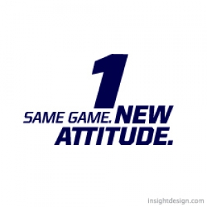
The Fox Sports 1 logo and new tagline were developed for print and television.
The logo tagline is designed so the different font weights can counter rotate.
Fox Sports Number 1 Logo and Tagline
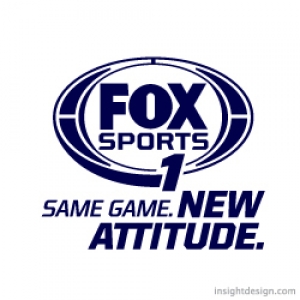
The Fox Sports Number 1 logo image and new tagline were developed for print and television.
The logo tagline is designed so the different font weights can counter rotate With the number 1 being the axis.
New Logo Design and New Website Design
http://youtu.be/RzUHAUFU3Fc
JunkPro is a professional junk removal business that we completely re-branded from new logo to new website design. The website design allows JunkPro to change and update easily with a content management system (CMS). Our client even can adjust his complex online consumer scheduling from his phone. We also designed and built the JunkPro website with search engine optimization (SEO) for excellent Google rankings. 1-800-JunkPro.com ranks number one on Google keyword search " junk removal wichita" and number one on Google local listings keyword search " junk removal wichita". The website design is quick to navigate, easy to understand and engages the consumer immediately with key information and a simple call to action. So now that our client is number one on Google the website design also moves customers to act.
We can't thank our client enough for all of his effort and assistance in developing this website.
Logo Design Wichita, the website of Tracy Holdeman and his team. For websites exceptionally branded, geared for search engine optimization (SEO) success and beautifully designed websites call or e-mail us. We specialize in website design, graphic design and logo design. Website Design Wichita.
Insight Logo Opens NASDAQ
Points of Light Institute introduces logo design and brand identity by Insight Design Communications. The brand is designed to attract new generations to civic engagement.
![]()
New brand logo design and identity featured during the NASDAQ opening bell ceremony in New York City USA.
![]()
Insight Design logo hits Times Square.
New children’s education property created by New York based Whisper, and Whisper team member, Insight Design Communications, of Wichita, Kansas USA. Insight Design Communications specializes in exceptional logo design and branding across all mediums.
A New York City based organization with a rich 15-year history is growing. Children for Children has joined forces with the Points of Light Institute, to create a new movement igniting the power of young people everywhere. Children for Children is growing to become…generationOn. The new logo, brand property, was nationally unveiled during the 2010 National Conference on Volunteering and Service, hosted in New York City June 28-30. The logo design appeared on invitations, programs and news media backdrops. Previously, the new brand logo and corporate identity was featured during the NASDAQ opening bell ceremony in New York City. The logo design appeared on the NASDAQ big board and the logo design was fearured on Times Square.
The new generationOn property was created by Steve Cranford, CEO of Whisper. Cranford developed the market positioning, the property name, and the verbalized 5- and 30-second story behind the name. A Whisper team member, Tracy Holdeman of Insight Design Communications, designed and created the brand logo, brand identity and other corporate identity designs for the new identity property. The logo design will be seen all over the United States, especially in cities like New York City, Kansas City, Oklahoma City, Denver, Atlanta, Los Angles and Omaha.
About Insight Design Communications
Insight Design Communications offers graphic design specializing in logo design, brand identity, corporate identity design and brand design across all graphic design mediums, including websites, print, advertising and environmental design. Insight Design Communications, based in Wichita, KS, has been a valued brand design partner of Whisper for engagements in the United States like Kansas City, Los Angles, Denver and around the world, including for clients in locations such as the Middle East and Canada.
![]()
The generationOn logo design by Insight Design Communications, a Whisper team member.
About Whisper
Whisper is a property developer. Rooted in communications strategy, Whisper creates intellectual real estate to generate returns, through effective market conversation designed to attract a wide audience. Whisper works with organizations so they may own the conversation® among competing product choices. Whisper client engagements span a variety of industries with organizations from North America to the Middle East and Pacific Rim. Whisper’s CEO, Steve Cranford, is formerly from Wichita.
About Points of Light Institute
Points of Light Institute mobilizes transformational people to answer humanity's call, whether for those struck by the headline, and the everyday. We show the way for people to tap into their own resilience and power to help others, and in doing so transform not only the lives of those we help, but also the lives of those who help. For people who answer this call, they are themselves transformed. As the largest volunteer mobilization network in the nation, Points of Light Institute includes more than 250 Action Centers that reach more than 83% of the nation’s population and extends into ten countries. generationOn is now a part of this powerful network, which delivered some 30 million hours of volunteer service valued at $615 million over the past year.
For more information:
www.pointsoflight.org
Points of Light article on the new rebranding
About generationOn™
generationOn, newly created within the Points of Light Institute, is the largest youth volunteer service organization in the nation. generationOn combines the expertise of Children for Children and other Points Of Light Institute offerings, such as Kids Care Clubs, HandsOn Schools and the HandsOn Action Center-driven programs, together under one banner. generationOn includes over 30 youth programs that engage more than two million young people in all 50 states and internationally, and 1,800 Kids Care Clubs throughout the 50 states and internationally from China to Saudi Arabia. Benefits: Young people who volunteer just one hour a week are 50% less likely to abuse drugs, alcohol, or cigarettes, or engage in destructive behavior. In a study of high school dropouts, 81% reported that opportunities for real world learning, such as the opportunities provided by generationOn programs, would make their classroom experience more relevant. Service learning in the classroom has been shown to increase attendance, improve academic performance and motivate achievement as students see the results of their work creating a positive impact on others.
generationOn Engages: Teens, Tweens and Younger: generationOn is created as a brand property that kids may embrace and call their own, by helping young people develop as healthy, empowered, creative problem-solvers and leaders. Parents and Families: Equipping parents and influencers to unleash and affirm the power of young people to identify and solve challenges within their community. Teachers and Schools: By providing curriculum, tools and resources to educate and excite kids about service and civic engagement. Nonprofit Community: Building capacity for organizations across America to engage and value young people and families as volunteers.
For more information:
www.generationon.org
www.childrenforchildren.org
generationOn Opens NASDAQ
Great Logo Design & Branding #2
#2. The ability to design type in any style.
A great logo design studio should have the ability to employ a variety of typographic solutions and the capability of creating a new type font. Font creation can be the key element that separates your logo from the crowd. Scroll down to see examples.
The QuickerTek logo type has a modified font. The stroke weight was increased to achieve a bolder look than the original font. The letter height was also increased. QuickerTek is a national brand.
![]()
The Old Town brand type was altered to create a more energetic feel than the original font. The stroke wieghts were varied, straight lines were skewed and different letter sizes were mixed together to give the design a bold, vibrant and fun look.
![]()
Timberline’s brand logo typography was designed and illustrated by hand to achieve a real woodcut look. This brand logo design appears at restaurants in St. Joseph, Missouri, Kansas City, Missouri, Salina, Kansas and Wichita, Kansas.
![]()
The Foulston Siefkin logo mark or brand image is simple letter forms designed as unique shapes. The clean and simple typography creates a horizontal movement that counters the vertical push of the (FS) branding mark.
![]()
The WorkHorse Recruiting logo type is one of those cases where a font straight out-of-the-box worked. The serifs of the WorkHorse type point in different directions. The top serifs point backwards while the bottom serifs point forwards echoing the motion of the circle eight filigree.
![]()
The GooGoo Wonderland branding typography is a combination of type creation and a stock font. The GooGoo is created to have the exact same circle shape for the O’s and the G’s. The Wonerland type is a font.
![]()
The Cosmetic Cafe logo type is a hand drawn script to communicate a sense of authenticity and intimacy.
![]()
The StoneBridge brand type is an old version of Goudy, a classic, old world, font that works well with textural images of stone.
![]()
The AgriQuip logo typography is the font Interstate Bold with the “A” and the “Q” altered.
![]()
The Douglas Design District logo typography combines two fonts. The “Douglas” and “District” type creates a horizontal visual and the “Design” type creates a vertical movement matching the vertical and horizontal vectors of the brand image.
![]()
The Darbuka Brand Perfumes logo type design is a modern American font that has a strong Middle Eastern visual reference. The variation in the stroke widths and serifs relate to the henna scourced brand image illustration and design.

The Tumbledrum logo text is an Insight Design font developed from cirlces and rectangles.
![]()
The Arts Council logo design uses Microgramma Bold and Light. “Arts” is reversed out to make a point of emphisis. The alternating black boxes reference the four squares above which elude to diverse artistic expression. The typography is also distressed to integrate with the branding image.
![]()
The WaterBug brand type is hand drawn to mimick water shapes and the brand image illustration of the swimming waterbug.
![]()
Tanya’s Soup logo type is a combination of fonts that were both altered using Photoshop filters to follow the line qualities of the branding image.
![]()


