HomeGrown

HOMEGROWN:
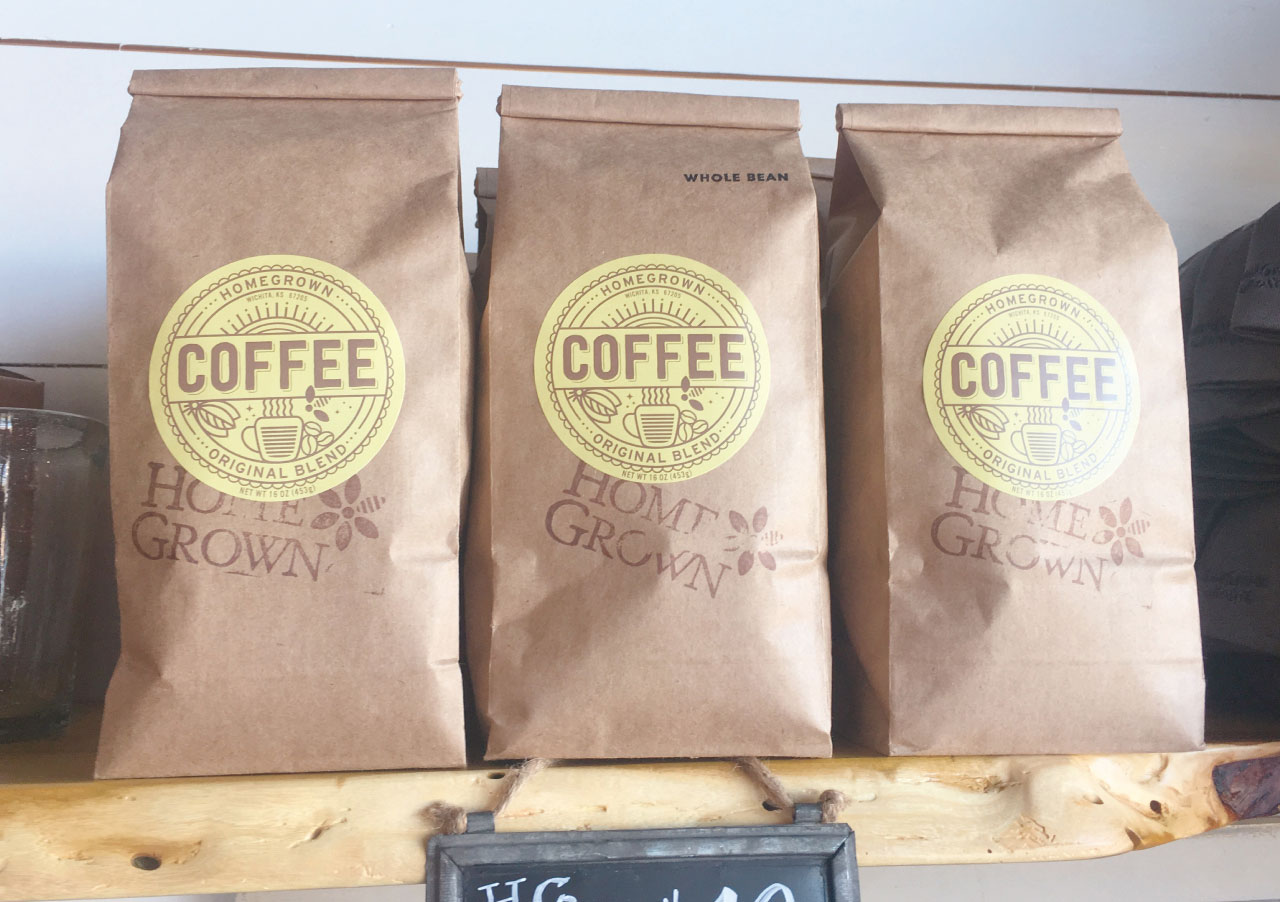
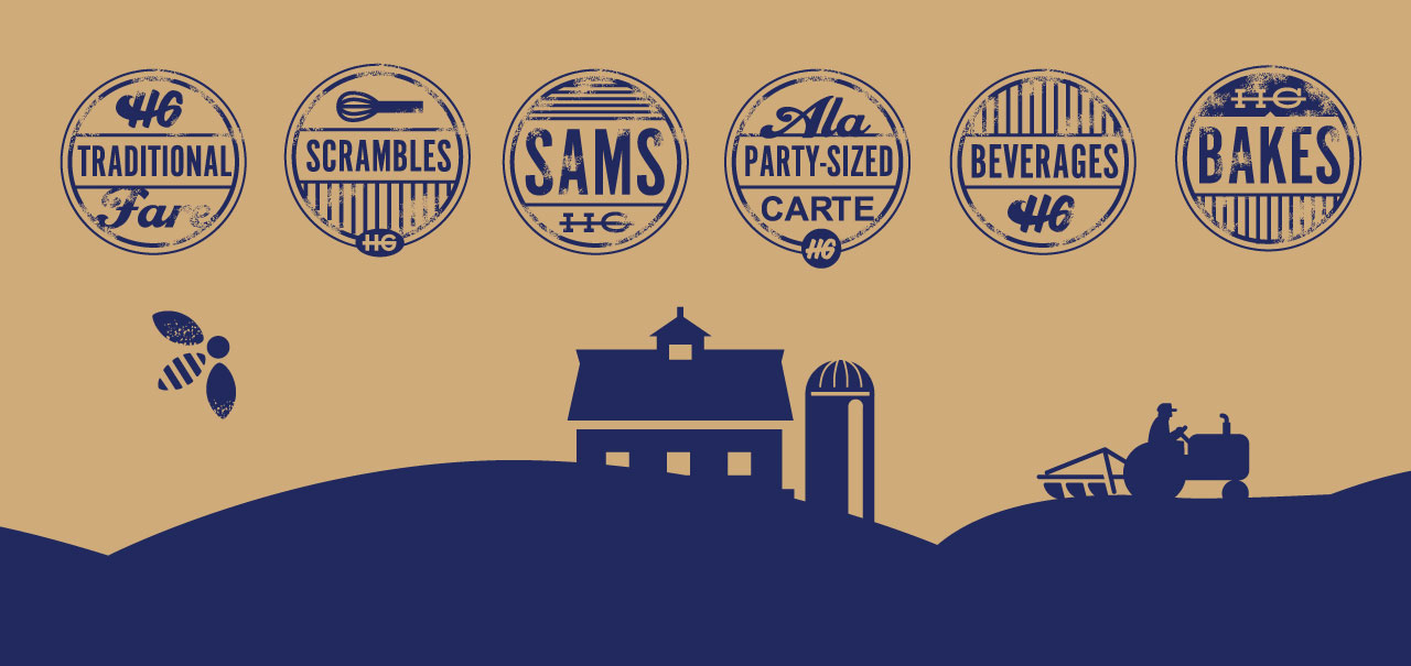
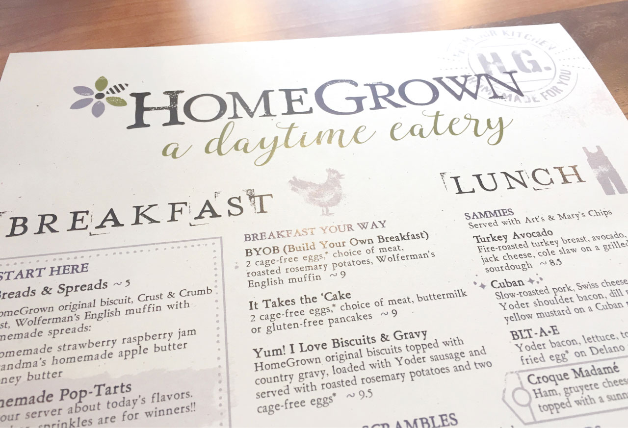
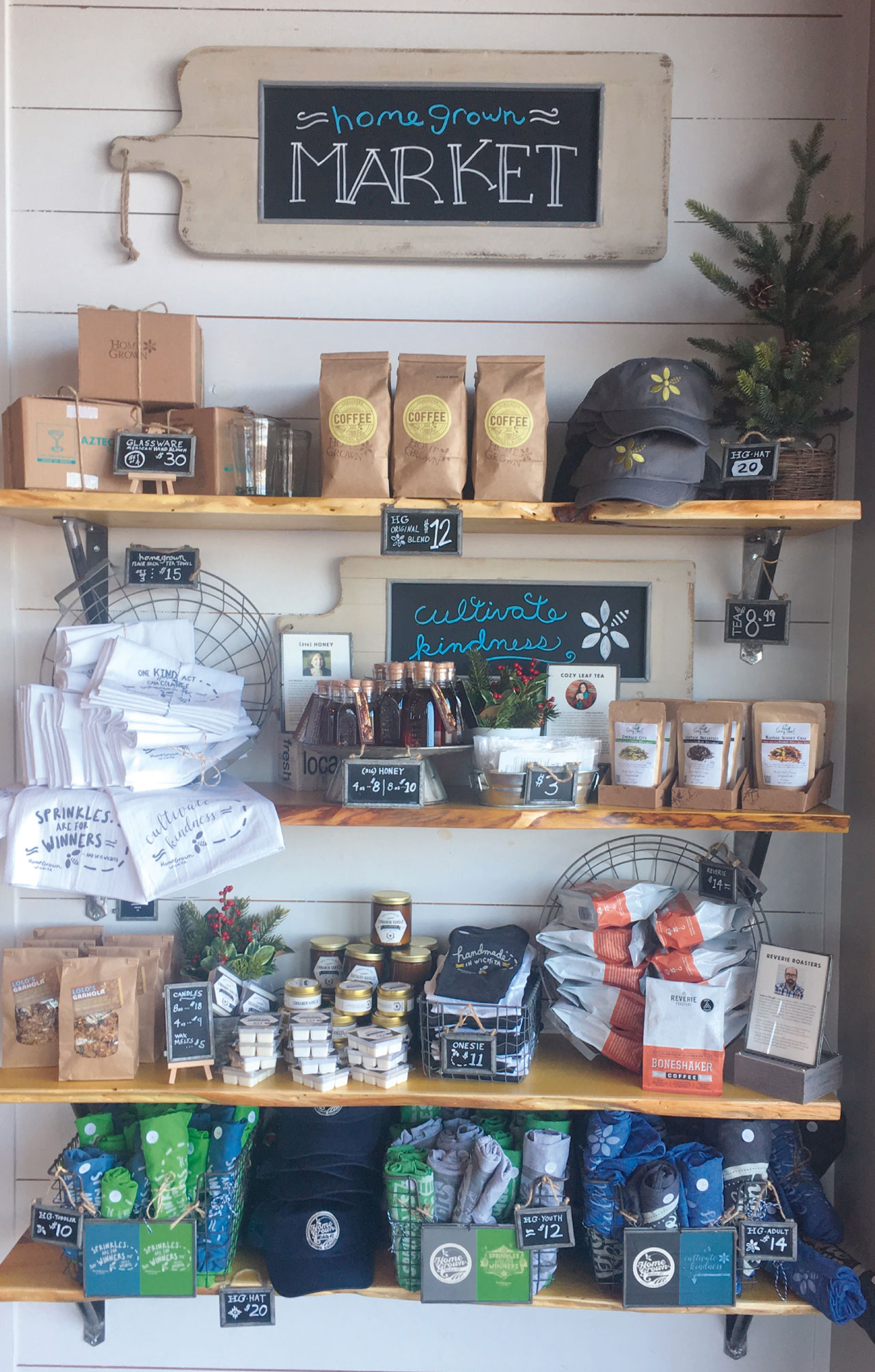
HomeGrown is a daytime eatery that uses locally sourced ingredients with their uniquely healthy and delisious menu. HomeGrown also serves jucies, teas and coffees, beer and booze as earlly as 6 AM. The logo design is a flower and a bee polinating the flower in one image. It represents the natural flow of life and the delisiousness found in healthy eating. Cultivate Kindness is one of HomeGrowns’ founding concepts. Bringing people together around kindness and delisious and healthy food is the vision of the owners HomeGrown.
HomeGrown Brand Development:
Logo Design | Branding | Signage | In-Store Signage | Point-Of-Sale material | Appearal | Package Design and more.


Logo Design Wichita, KS – Tanya's Soup Kitchen
http://www.youtube.com/watch?v=73wiBugaNX0
The Tanya's Soup Kitchen logo design is the image of Tanya Tandoc and a bowl of soup in the same image. The Tanya's Soup Kitchen logo design is a visual metaphor to show Tanya is the equal of a true artist. Tanya puts herself into her creations, her art, her soup.
In the logo design Tanya's face is the bowl, her mouth is the spoon, her eyes are splashes/droplets and her hair is the steam. All the graphic design shapes and lines of this logo where drawn and redrawn, then scanned into digital form and re-drawn digitally. All the graphic design edges and curves were smoothed and softened to invite the viewer and remind the consumer of how beautifully delicious Tanya's soups really are.
Tanya and the Tanya's Soup Kitchen logo design and graphic design brand identity have become interchangeable, recognized as one-in-the-same. Her website design and Facebook persona allows Tanya to share her unique attitudes with her many fans and friends. All the graphic design in Tanya's brand identity reflects and has become the symbol for Tanya's amazing personality. Tanya has become more than a proprietor of a sheik restaurant, she has become a food goddess and a beacon for sub-culture lifestyles and attitudes. The early lines anticipating a bowl of Tanya's amazing soup often extend from one side of the restaurant to the other and even out of the door. Tanya has become famous in the Wichita area and well know in the highest perches of the food industry.
This brand identity video includes; logo design, website design, environmental and print.
oin the attitude at
http://www.facebook.com/tanyassoupkitchen
http://www.facebook.com/tanya.tandoc
http://tanyassoupkitchen.com/
Tanya's Soup Kitchen is located at: 1725 East Douglas Avenue Wichita, KS 67211
Tracy Holdeman is founder and creative director of Insight Design Communications, executive creative director of WhisperNewYork. His logo design, brand identity, website design and graphic design work has been recognized with over 100 national and international awards.
Insight Design Communications has been honneres with over 100 international awards for logo design, graphic design and brand identity design.
You can see more of Tracy Holdeman's graphic design work at Logo Design Wichita


